








Microsoft won’t admit its New Outlook is terrible, but it knows plenty of users still prefer Outlook Classic. And to address this, Microsoft has just cloned Outlook Classic’s look and turned it into a theme for New Outlook, in the hope that holdouts will finally switch. Yes, you can now make New Outlook look like the classic one, although it’s still a web app.
There’s a new optional setting in New Outlook for Windows 11 and Windows 10 that allows you to use this classic design as a “theme.” Microsoft began rolling it out in August 2026, and it finally showed up on my PC.
I went to New Outlook’s Settings > General > Appearance and turned on “Enable classic Outlook style.” Once enabled, New Outlook looked a lot closer to Outlook Classic.
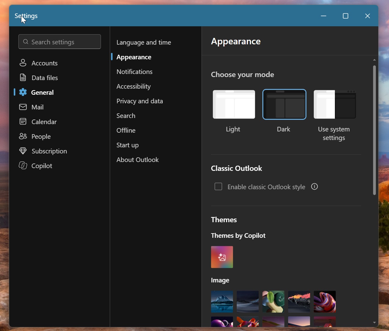
That doesn’t change the fact that New Outlook is still a web app running in an Edge-powered container, but it’s also why these themes are so well cooked.
Microsoft can easily customize how New Outlook looks because it’s a website at the end of the day, so a bit of CSS and JavaScript can take you from the new design to the one you loved all these years.
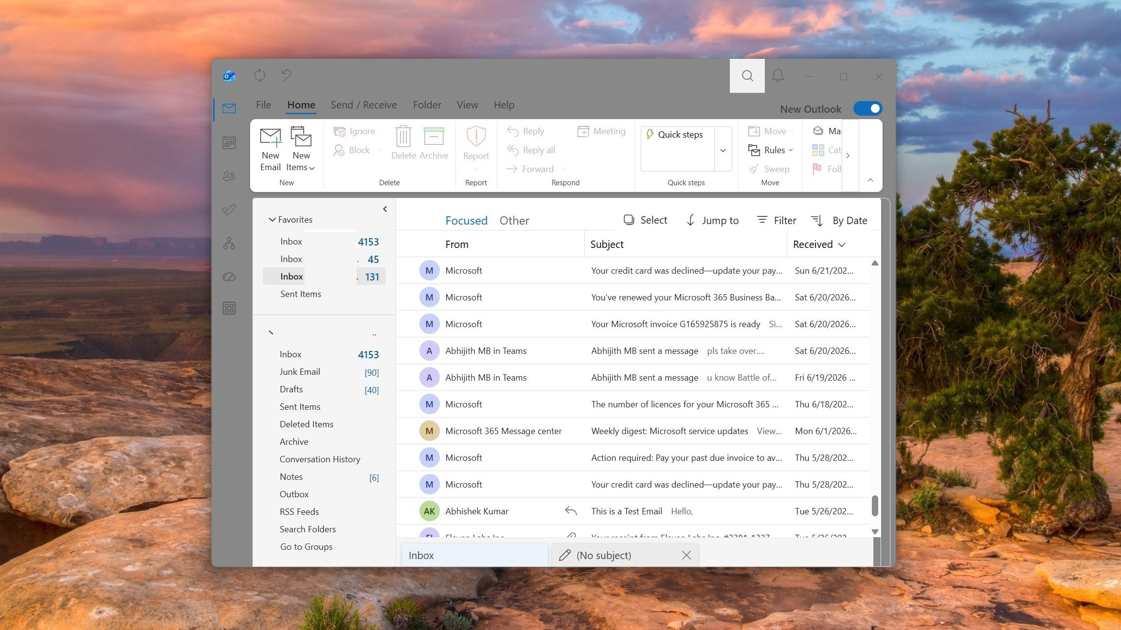
In our tests, Windows Latest observed changes across New Outlook’s interface to make it resemble Outlook Classic. For example, I noticed that the title bar, icons, folder list, and ribbon all changed to look more like the classic version. This is the New Outlook running Outlook Classic, and you’d be surprised how identical it looks:
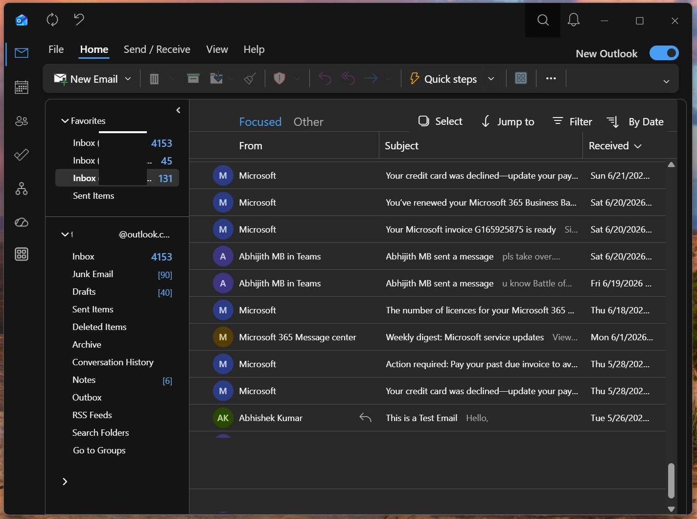
Even the blue patterned title bar, which is one of the flagship design aspects of New Outlook, is replaced with a plain dark background, again matching the classic version.
You’ve also got an updated navigation bar, but there are not a lot of changes here. Microsoft has made the background darker in dark mode, and you’ve got monochrome outlines for the Mail, Calendar, People, and other app icons. We’re getting a new Calendar view as well with classic theme:
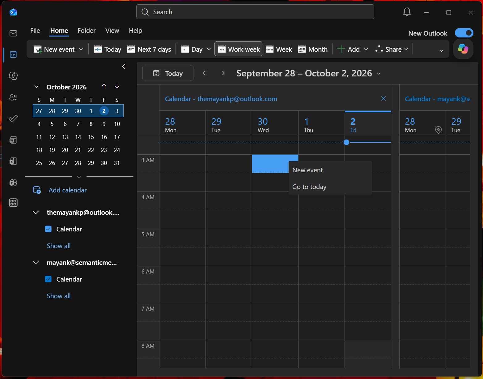
Right now, New Outlook has colorful icons, so by just changing the icons and making the background darker, Outlook Classic is being recreated.
In a support document seen by Windows Latest, Microsoft confirmed it’s paying attention to iconography and typography to bridge the gap between the two apps.
“When enabled, the setting applies coordinated changes across the Outlook experience, including visual styling, layout, typography, icons, and selected interactions,” Microsoft explained. “This update is designed to help users who are transitioning from classic Outlook by providing a more familiar experience while maintaining the capabilities of the new Outlook.”
Microsoft has also redesigned the mail folder list, so it looks more compact, like the Outlook Classic version. You’ll no longer see icons beside individual folders such as Inbox, Drafts, and Sent Items.
And the most noticeable part, the ribbon, has some familiar design changes, too. For example, if you’re in the mail view, you can see a Send / Receive tab alongside File, Home, View, and Help. The blue “New mail” button also becomes a neutral “New Email” button and copies Outlook Classic’s iconography.
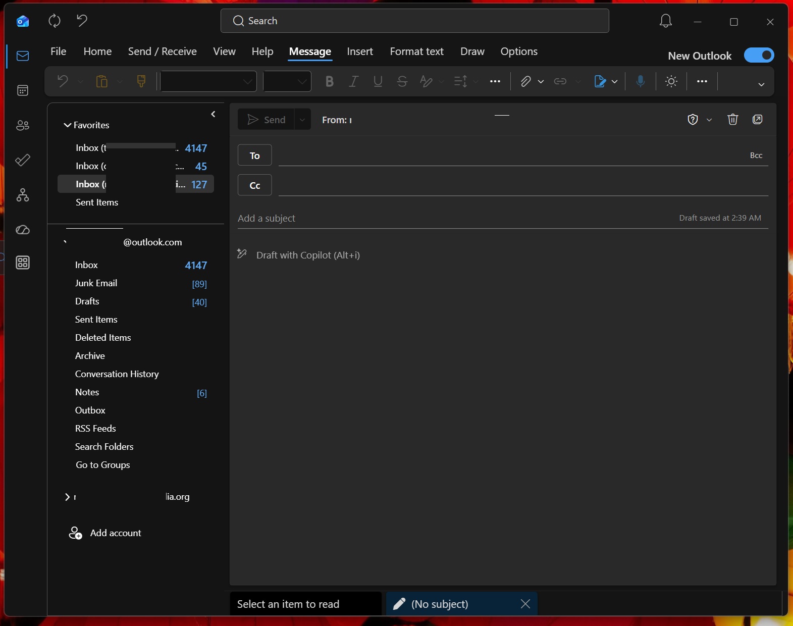
Last but not least, if you open the compose window, you’ll notice the same Outlook Classic-like design treatment. For example, you’ll see Message, Insert, Format Text, Draw, and Options tabs across the top, with formatting controls in the ribbon below.
I could continue listing everything I spotted, but it’s quite obvious Microsoft has done a pretty good job of bringing Outlook Classic’s look to New Outlook. Now, it just needs one thing: bring back the native Outlook app because whatever we have right now is still a RAM-hogging Edge instance!