Microsoft’s design language has evolved over the years with many changes that were dearly loved by fans and many that were very much disliked. This time, however, we’re talking about Windows 10 and it’s 1px border around the window edges.
The 1px border around the window edges is by far the most hated element of Windows 10’s design. Mainly because a window is the most basic thing that makes Windows, Windows. And the worst thing about it is that it’s always there, everywhere.
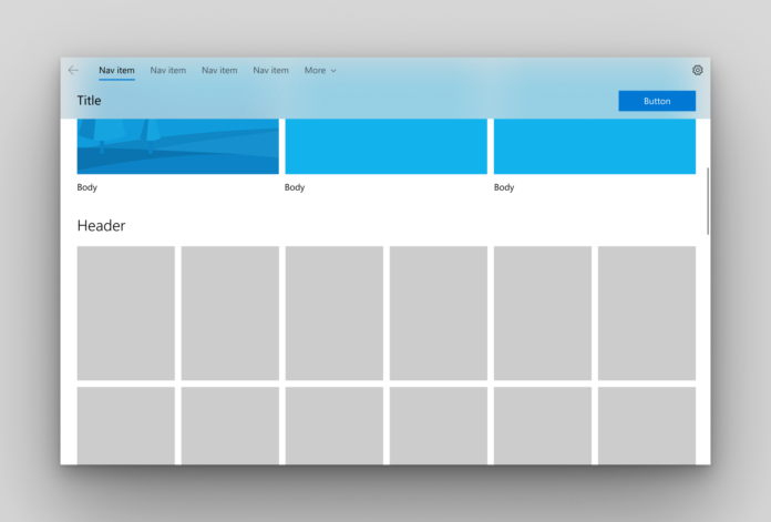
Microsoft recently updated their documentation for NavigationView control and the new documentation shows off some screenshots of how the control works. Besides the control itself, the screenshot also features a beautiful drop shadow around the window and yes – without the 1px border.
The screenshot is certainly just a mere mock-up. But it gives us a closer look at how this could look like for specific apps. However, this is destined to happen at some point in time.
“I’ve previously prototyped this. It fell apart for me not in isolation – you don’t need a border there – but in usage with a number of applications / multitasking wherein it was difficult to effectively determine application boundaries and grab points,” Microsoft’s engineer explains on Reddit.
Microsoft had already shown off many mock-ups featuring the similar absence of 1px border before. In fact, in recent Redstone 5 builds, Microsoft has already gotten rid of the 1px border around the edges of many UWP controls such as context menus and dialogue boxes and was replaced with a drop-shadow instead.
Updated with statement from Microsoft’s engineer.


