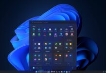
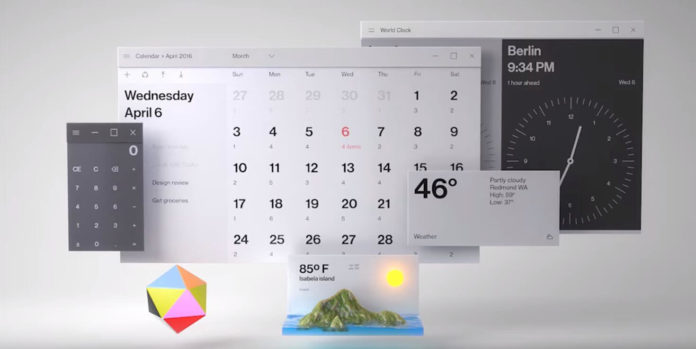
Last year at Build 2017, Microsoft had introduced their new design language would be embedded by them in their Windows ecosystem. It was called Fluent Design Language system that consisted of 5 basic elements Depth, Motion, Scale, Material, and Light around which this whole design system works. Since it’s launch we have seen Microsoft implementing various components of this Fluent Design Language on Windows 10 and the native inbuilt apps.
Microsoft has also announced the introduction of Fluent design language for their web services and they had posted few demos for the web fluent design as well. An important highlight of those demos was that Microsoft made sure that the design language feels same across web and Windows ecosystem.
Microsoft has today teased us with their upcoming changes to the Microsoft Account website dashboard which now has Fluent Design language to make the website feel more informative and interactive.
The changes in the Microsoft account dashboard page mainly contains the introduction of the Depth and Motion component of the Fluent Design language. When a user hovers over a card on the MS account page it slightly pops up with a shadow in the background and gives an effect of depth with respect to other cards. Hovering over card also has the motion effect with beautiful animation on the icons to highlight a little more detail about the content.
@mehedih_ https://t.co/5vpDGjBqpV now has fluent design on the home page pic.twitter.com/JgqImViW9j
— Isaac Daly (@DalyIsaac) April 13, 2018
Currently, it is not available to everyone rather only a handful of users were able to try this out. Our readers can check out the MS account page here and see if they can get an early look at what Microsoft been working with their accounts web page. The public rollout depends on the feedback from the users and if everything goes as per the plan, you can expect the new design in the coming weeks.


