


")


Windows Run, opened with Win + R, is one of the features that nobody really expected would get a makeover, at least not before legacy dialogs like the Properties tab in File Explorer. For those unaware, there’s a modern version of the Run dialog that isn’t official yet, and it’s quietly getting a design refresh ahead of its public rollout.
I wouldn’t call the Run dialog a lesser-known feature, since most of us have used it at some point. Run opens when you use the Win + R keyboard shortcut, and it allows you to quickly launch apps if you know their paths, or even find hidden Windows utilities, such as msconfig.
Windows Run hasn’t been updated in decades, and I do not think the reason is simply “Microsoft does not care.” It’s more likely that the Run dialog is a low-priority utility, which isn’t a bad thing.
Practically speaking, Windows Run works just fine, power users depend on it, and Microsoft has avoided updating it because “why fix something that isn’t broken?”
However, Run does not align with Windows 11’s design, and that means it does not fit with Microsoft’s new plans. The company plans to make Windows design language more consistent, and it’s not possible without updating all legacy dialogs with a modern version or at least adding dark mode.
Now, Microsoft is experimenting with two big changes for the Run dialog. First, Microsoft has confirmed it’s testing dark mode for Windows Run.
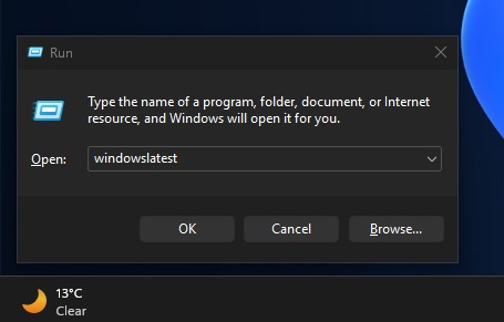
This update won’t change how Run works or looks, as it only adds support for dark mode for those who use Windows 11 in a dark theme.
But the second change is more interesting, as there’s a hidden modern variant of the Run dialog, which is completely optional and needs to be turned on from Advanced Settings (formerly developer tools) in Windows Settings.
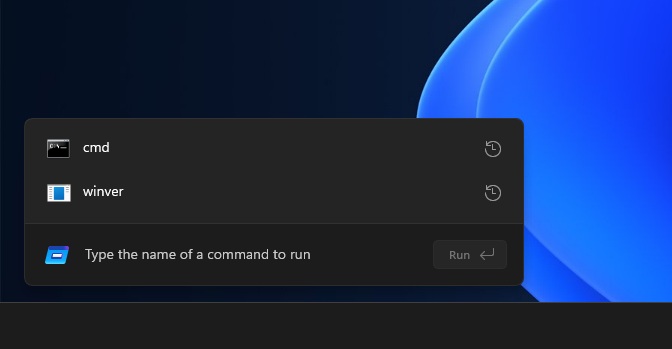
I tested the modern Windows Run, which is getting a design refresh ahead of rollout
Microsoft hasn’t officially announced the modern Windows Run dialog, but it is present in newer preview builds, and it appears to have been updated recently. The latest version has a slimmer design, which suggests that Microsoft is still actively refining the UI before it decides to roll it out publicly.

In our tests, Windows Latest observed that the updated modern Run dialog is now much slimmer and closer to a floating search bar than a traditional dialog box. There’s a new ‘Run’ icon, which is in line with Windows Fluent Design, and it now sits on the left side.
The new arrangement makes Run look slimmer, and the text field is centered. The Run button is placed on the right.
![]()
But don’t worry if you hate the feature, as modern Windows Run will remain a fully optional feature, which needs to be turned on from Advanced Settings.
Also, Windows Latest understands that the modern Run dialog could be more than just a simple redesign, as Microsoft may have plans for advanced features in Run. In our tests, I found the modern Run to be as good as the legacy version, and I don’t really mind Microsoft testing modern alternatives, as long as it remains optional.
What do you think about modern Run? Is it a good idea? Let me know in the comments below.


")


