


")
")

 and it removes old modem drivers")

Microsoft’s design team has recently showcased, on their dedicated Instagram page, the scientific approach they took while redesigning the Start menu for Windows 11. The post also features a few other variations of the Start menu, which honestly look more intriguing than the new Start menu we have with Windows 11 25H2.
But unfortunately, the comments were filled with users calling out Microsoft for ads in the Start menu, worse performance, glitching animations, and how they liked the blocky design of Windows 10. The comments section was blocked after some time and still remains that way, but it’s not specific to this post.
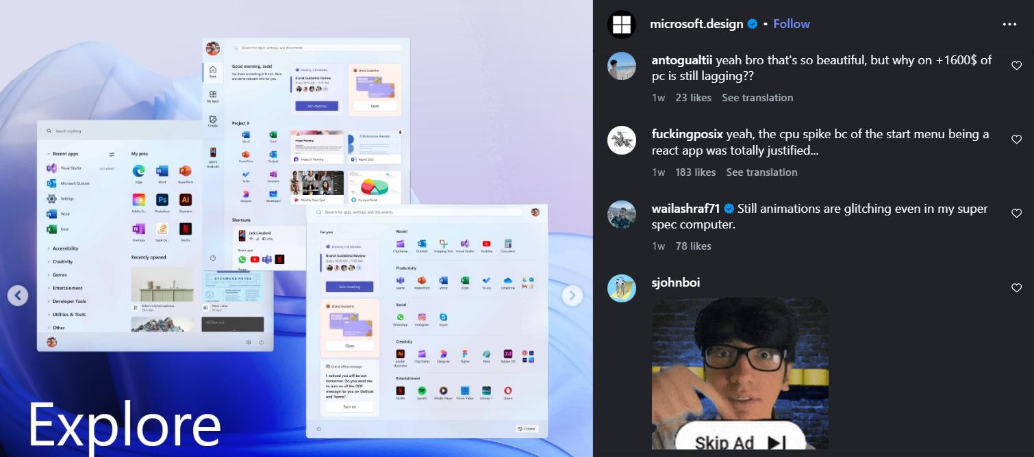
Either way, as some users also mentioned, the prototype Start menu designs look more beautiful than the current style. Note that, about a year ago, the Windows Design team already shared a blog showing off 5 different prototype Start menus, and detailed their reasons for choosing the new Start menu.
Now that all Windows 11 PCs with the latest update have got the new Start menu, it made sense for the team to repost the reasoning behind the redesign on a different platform; Instagram, in this case. But now, the prototype Start menus are getting attention again…
Microsoft designed 5 different Start menus for Windows 11
The Windows design team says that they went through a “plethora” of Start menu layouts before finalizing the one we have now. The following are the different Start menu prototypes they shared, and each one reminds me of what the Live Tiles in Windows 10 could’ve been if it hadn’t been discontinued.
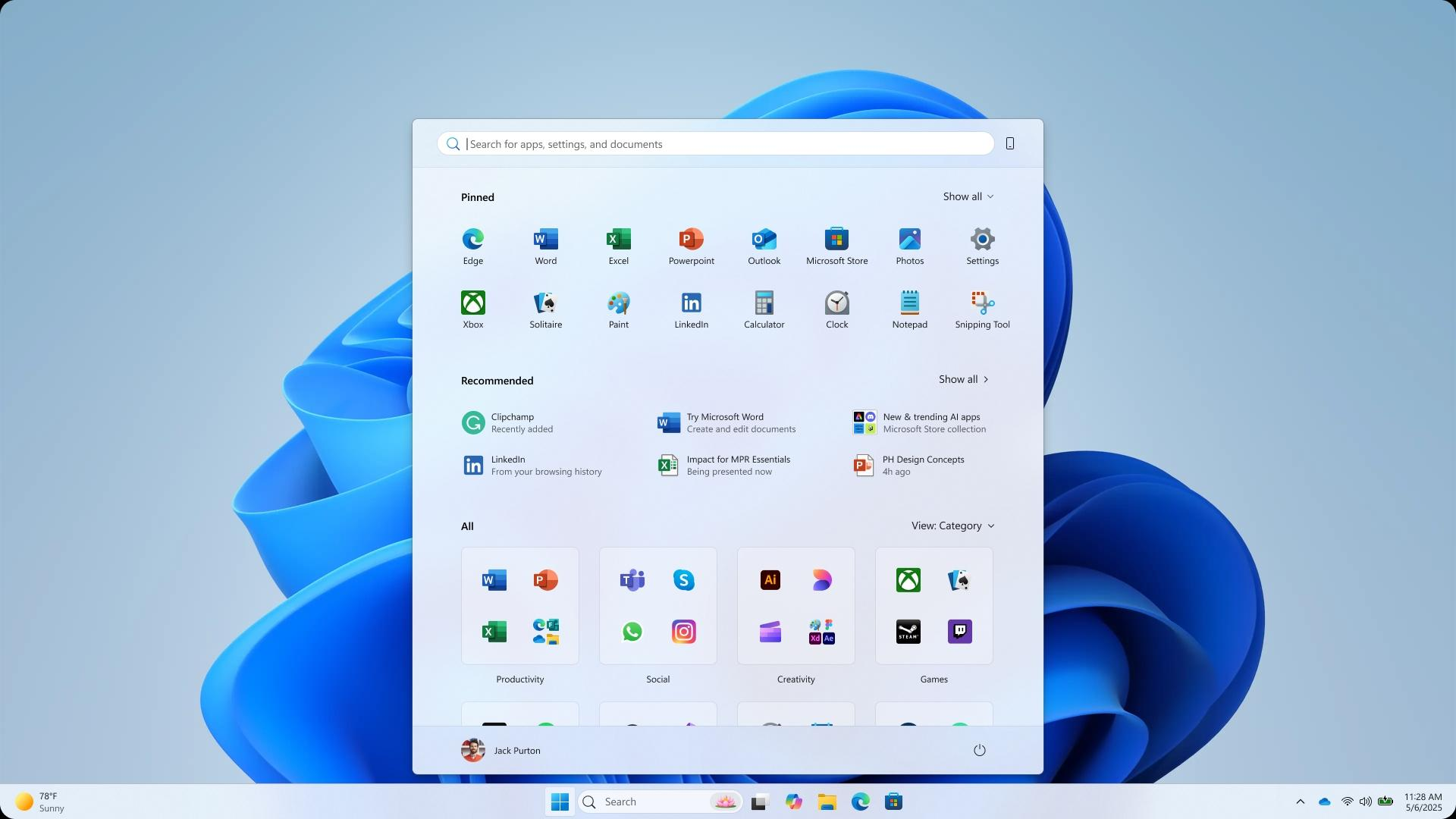
Start menu #1
Microsoft’s idea for this Start menu has several categories for all apps, as we have now, but instead of folders, they are laid out in a Grid. The Start menu we have now already has a Grid option, but it’s categorized in alphabetical order.
There is a “For you” section on the left, with Widgets, featuring Teams, PowerPoint, and of course, Copilot. Interestingly, there is also a Create button on the bottom right side.
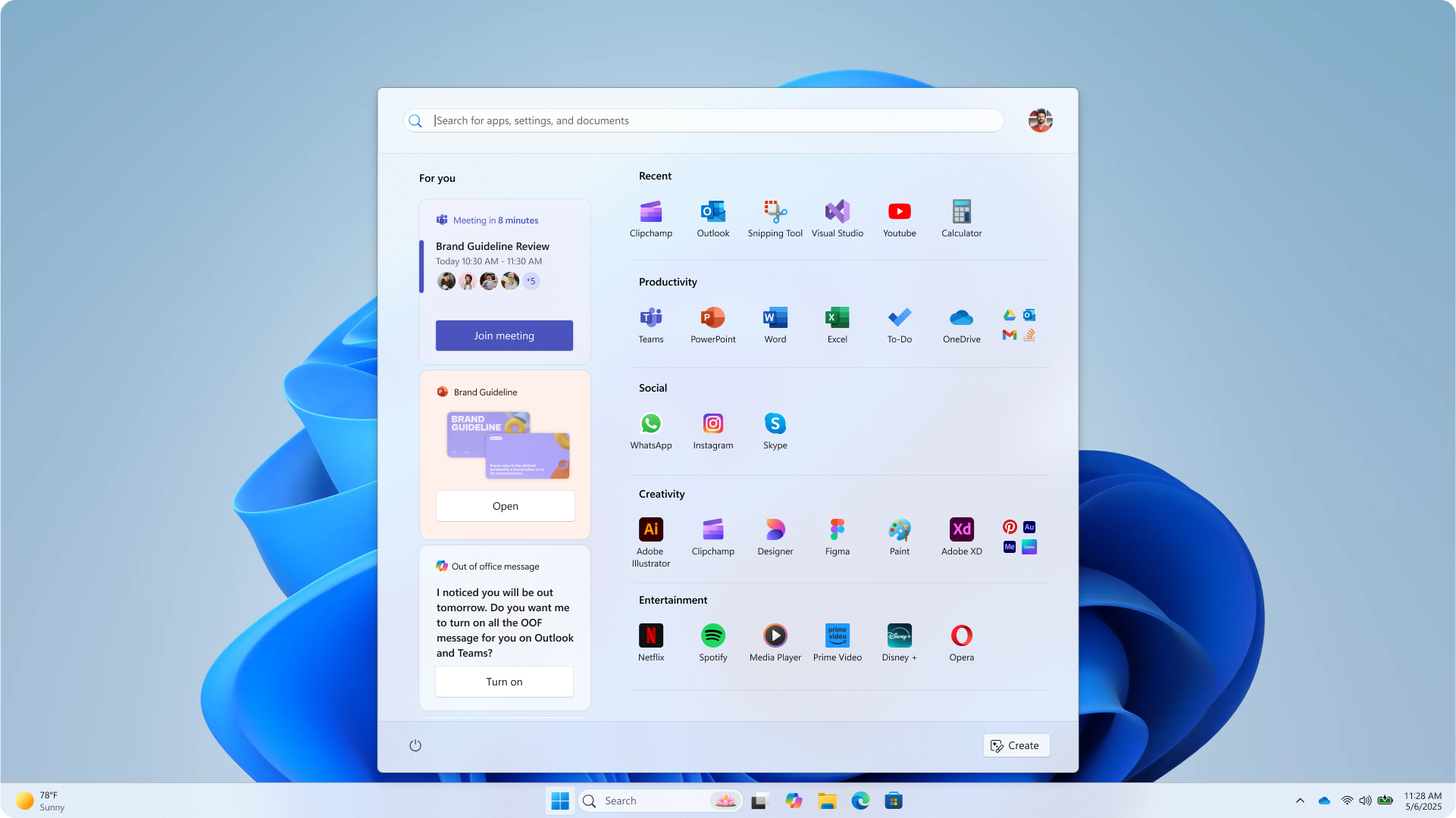
Start menu #2
The second Start menu prototype features the same “For you” section, but the widgets here are arranged horizontally. There is no sign of a power button here, but as these are prototypes, there is no point in finding mistakes.
This one also features the Pinned section, which appears to be able to pin Widgets, like Spotify. This is definitely something that I wish the Start menu we have could do. There’s a separate button to invoke all apps, just like the original Start menu for Windows 11.
Start menu #3
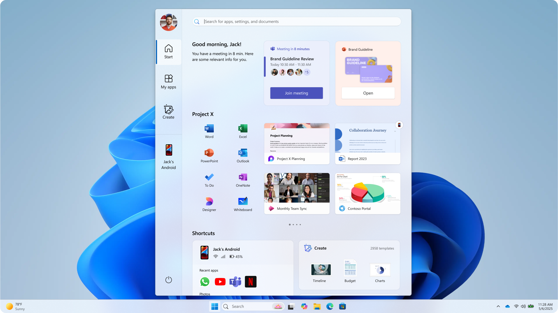
This Start menu honestly looks like an app. But the aesthetics and intelligence here are brilliant. On the left, there are different options such as Start, My apps, a Create button, and a Link to Phone integration.
The top section in this layout has smart widgets, followed by a horizontally scrollable section where you can pin apps and widgets based on projects. This definitely looks ahead of its time, and I believe that as AI becomes as ubiquitous as the internet, a personalized UI like this could become the norm.
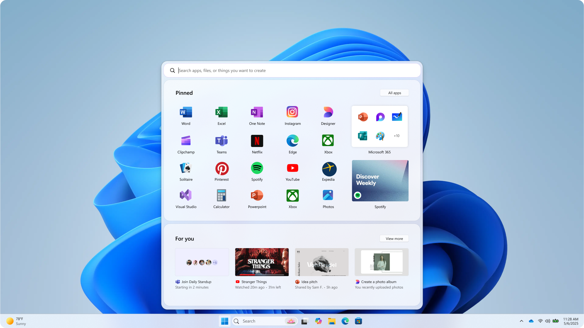
Start menu #4
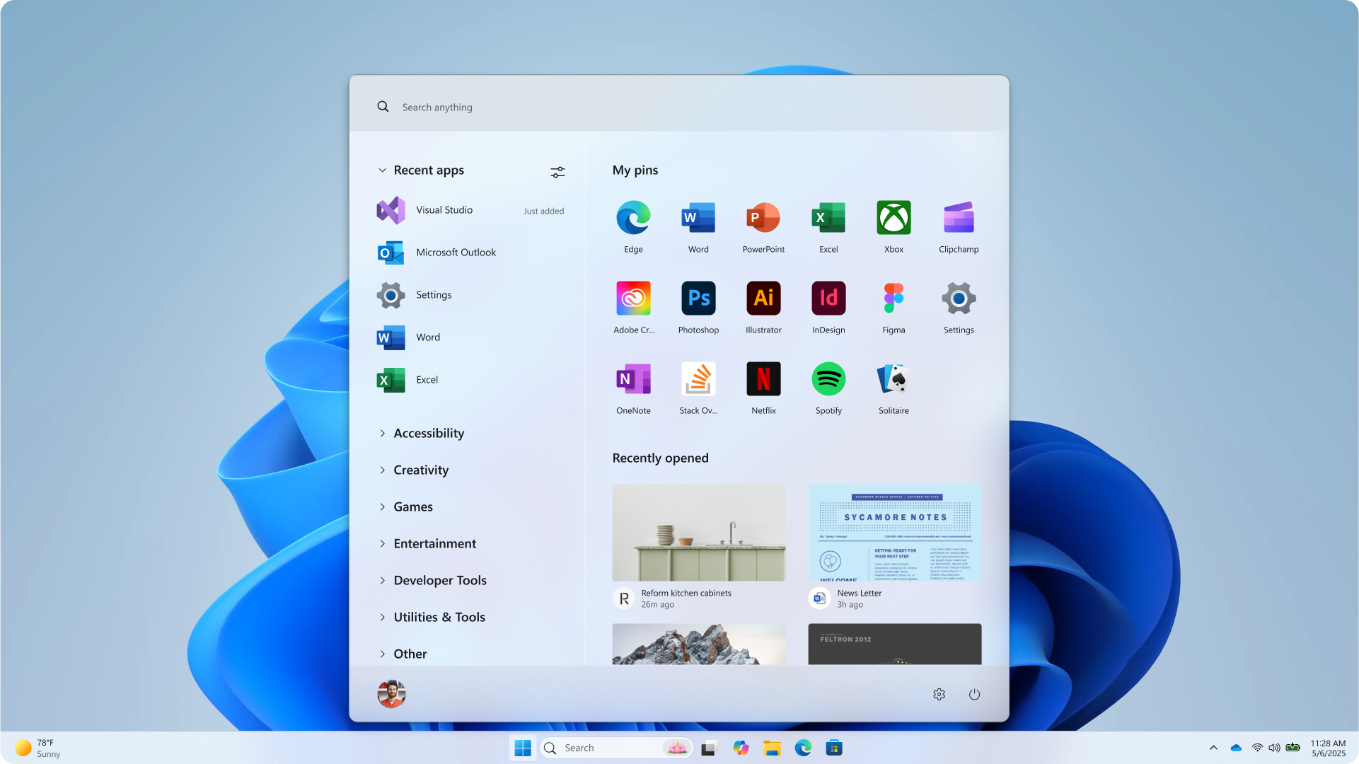
It’s clean, minimal, and I can see myself using this daily. It can pin apps, with a scrollable grid of recently opened windows as widgets. The left houses different categories like Recent apps, Accessibility, Creativity, Games, etc, all hiding their individual apps in drop-down menus.
Start menu #5
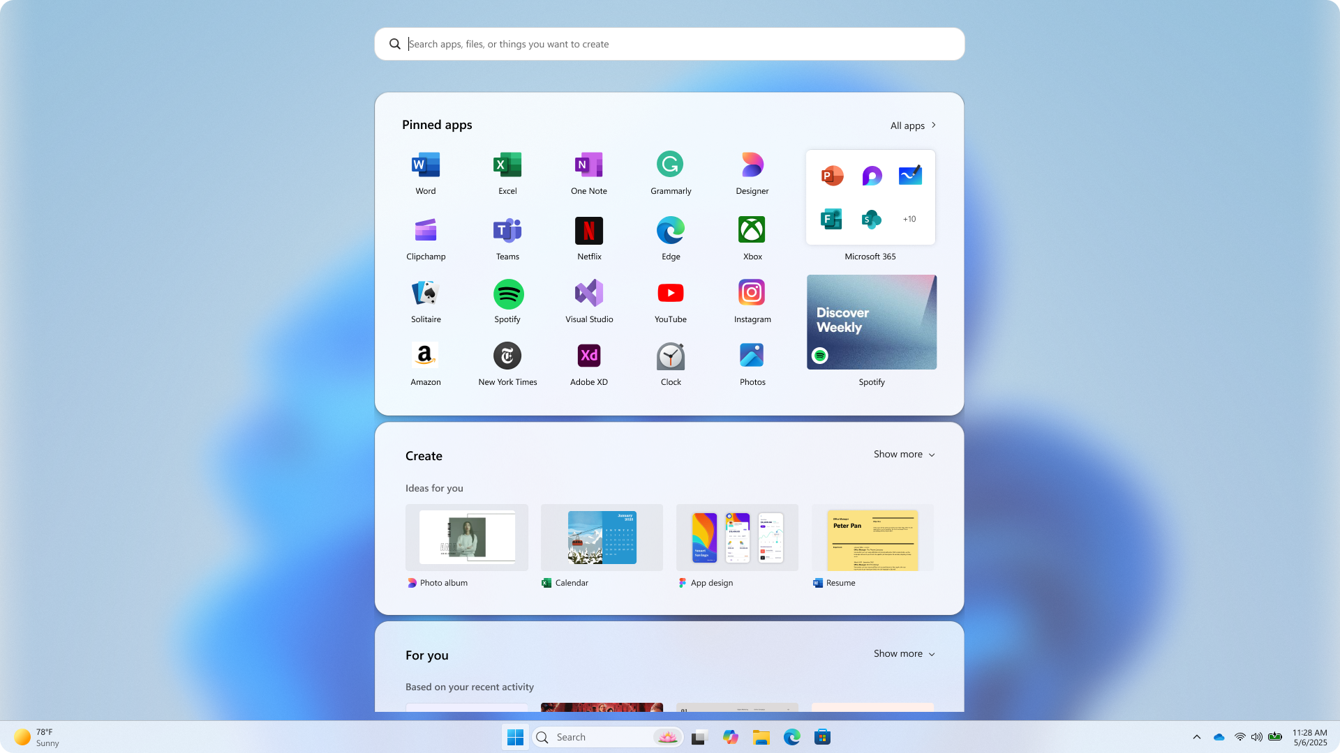
The last one looks similar to the second one, except that it looks to be a scrollable Start menu, with Pinned apps, Create section, and a For you section. Each has a Show more button as well.
The create section seems to showcase design ideas based on what the user usually works on. Here, too, the Pinned apps section can pin app Widgets like Spotify.
If there is one thing that I can take away from these mockups, it’s that I miss Live Tiles.
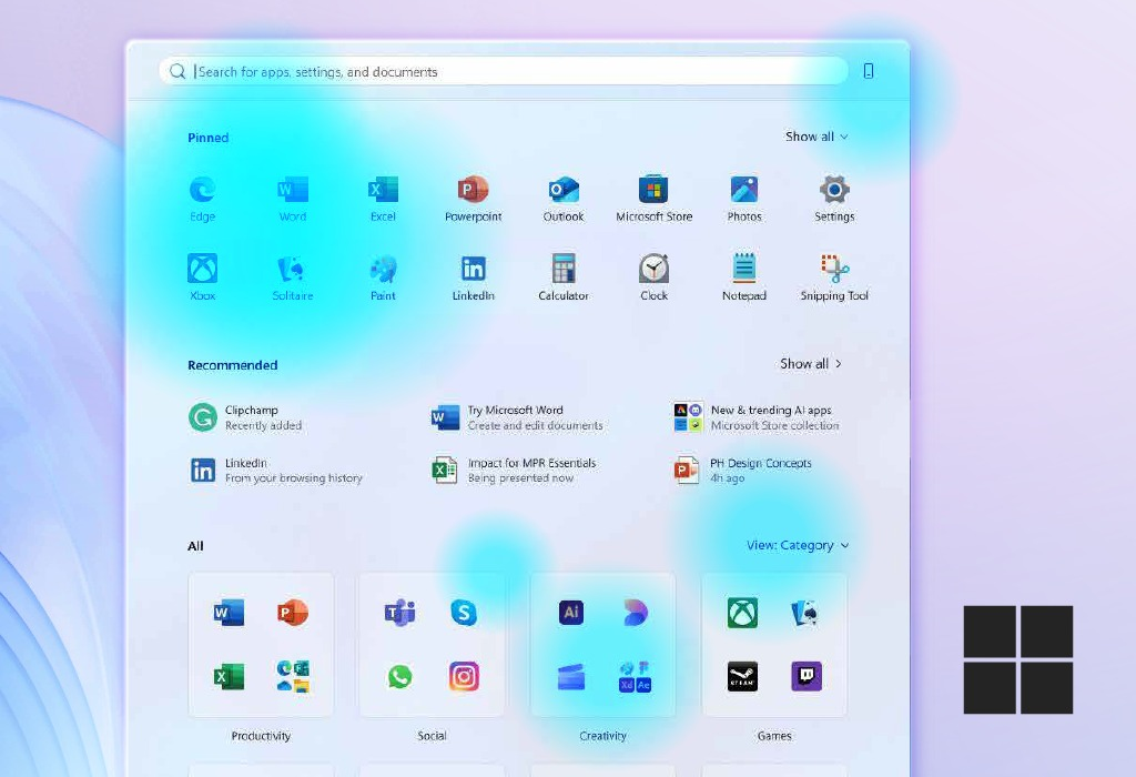
The Start menu we have now is basically a box with app icons. Sure, the Category view is good because the categories themselves are unique to every PC, and Phone Link helps too. But the sheer lack of anything apart from icons makes me wish for interactive widgets, like the ones in these mockups.
However, Microsoft’s studies with over 300 Windows 11 users, combined with what users asked for, showed them that there wasn’t any other way…
Microsoft explains the philosophy behind the new Start menu
The Windows Design team knew that users wanted easier app discovery, better suggestions, and more control over pins, recommendations, and Phone Link.
Microsoft’s solution was to combine the two pages from the original Windows 11 Start menu and make it a single page with Pinned apps on the top, recommendations below, followed by three different styles to show all apps. Plus, they added extra controls to show more pins, more recommendations, or even hide recommendations entirely, something which the original Windows 11 Start menu couldn’t do
Microsoft had two main testing methods for the new Start. One involved user testing with “live co-creation calls” where the company tracked eye movements, marked heatmaps, and combined that with how users scrolled and reacted to every change.
Then, the company tested the new Start menu on a myriad of devices with screen sizes ranging from 12 inches to 49-inch ultrawides. The result is the Start menu that we see and are indifferent to.
It’s a shame that Windows 11 Start menu lacks any sort of widget capabilities. But then again, it’s not like Microsoft has done any work to bring widgets to even their first-party apps. At a time when Android, iOS, and of course, macOS have support for interactive Widgets, it’s high time Microsoft did the same.
And no, I don’t think the dedicated WebView2-powered Widgets section with Discover feed on the left side of the taskbar deserves a mention here.
Either way, the Start menu is going to get a lot faster once Microsoft delivers on their promise of making it fully native. This, combined with the full list of all features coming to Windows, will probably make me forgive Microsoft for not making the Start menu as memorable as the ones in XP and 7.


")
")

 and it removes old modem drivers")
