
")


")


Microsoft is slowly enforcing a new icon design for its apps across all platforms. Instead of icons with a square layout and sharp edges, Windows 10 is moving to a rounded square shape and Microsoft says this new rounded corners will be visually more appealing and easier to digest.
Microsoft wants to bring consistency and a cleaner look to all its apps. Earlier this year, Microsoft started pushing the new icons to Office apps, inbox apps and other first-party apps on Windows 10. Microsoft also updated first-party apps like Calculator with rounded corners.
Microsoft has now started rolling out a new Chromium Edge update that ditches sharp icons for icons with rounded edges. The update is heading to testers in the Edge Canary and it will be released to everyone later this year.
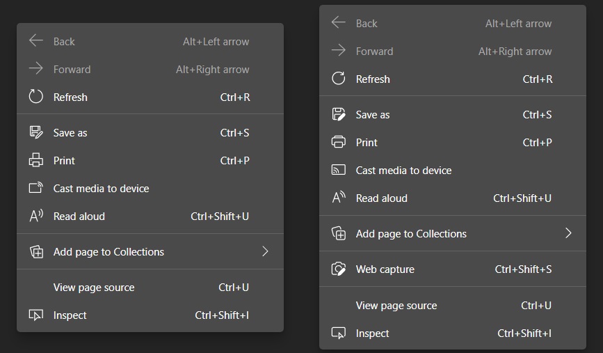
These changes are subtle, but still noticeable when you compare the old design with the new one.
![]()
As you can notice in the above comparison, Microsoft is dropping sharp-edged corners for new rounded corners across, making the “icons feel like they live in the real world”.
These pop-ups can be found in the menu, settings page, pop-up alerts, or right-click (context) menu.
Again, these changes are subtle but they’re noticeable if you look carefully and it’s another confirmation that Microsoft is betting big on rounded icons.
![]()
These rounded corners and icons are expected to replace the Metro UI’s sharp-edge corners across all apps. For example, the latest update for Windows 10’s Alarms & Clock app has introduced rounded-edges.
It’s also worth noting that Windows Vista and Windows 7 did have rounded corners, however, the company decided to remove all rounded corners and aero effect when Microsoft adopted the Metro UI and Fluent Design UI with Windows 8 and Windows 10 respectively.

Windows 10 is expected to get a new UI update in the second half of 2021 and it’ll also focus on rounded corners. The current plan is to improve the consistency across all products, implement new icons, remove the accent background behind app icons, and eventually replace Windows 10’s UI with Fluent Design-based WinUI.
")

")


")
