
")


")


Windows 11 brings a new design for the operating system and apps, giving us a break from the metro interface that has been around since Windows 8. Microsoft’s Fluent Design is an ongoing design language journey and it’s evolving with every Windows release, but it hasn’t touched every part of Windows and Microsoft’s apps.
With Windows 11, Microsoft is rethinking its Fluent Design approach and implementing its new design language across all its apps and pages.
As part of the Fluent Design overhaul, Windows 11 also comes with a new design material called “Mica”. Mica is a dynamic material that brings theme and desktop wallpaper closer, and it’s noticeable when you’re browsing apps like Settings or Edge. Mica material will paint the background of several app windows and settings to create a visual hierarchy.
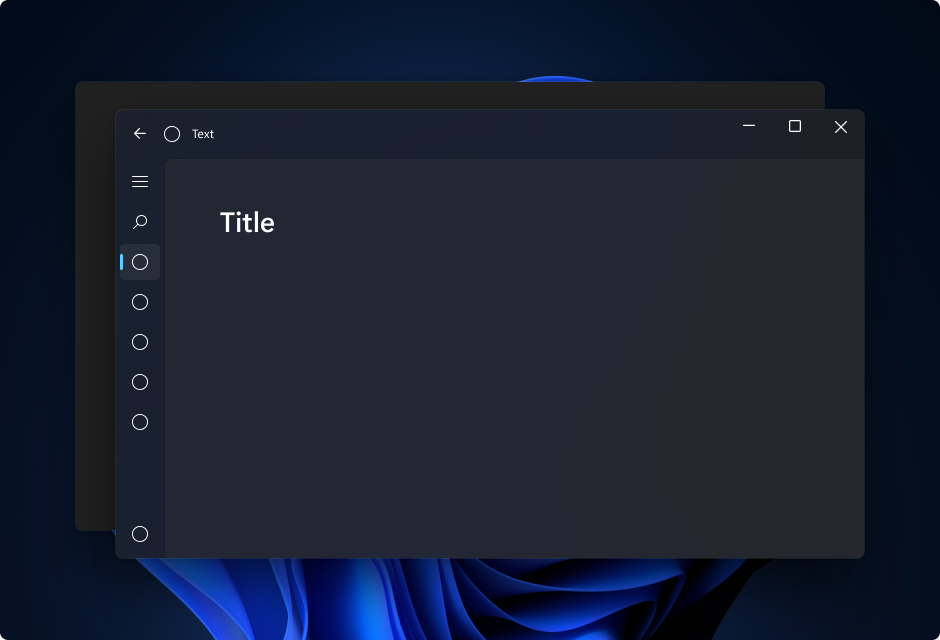
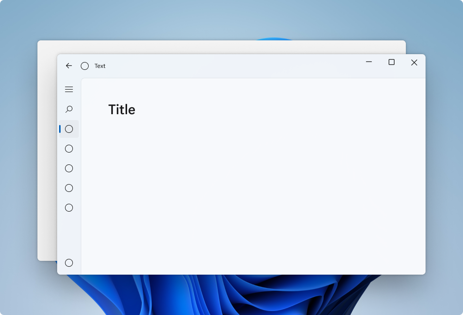
On Windows 11, Mica will be the most common design element and it will show up across apps and the OS itself. Mica material is not about transparency. Instead, it allows the desktop background behind the window to focus blur through.
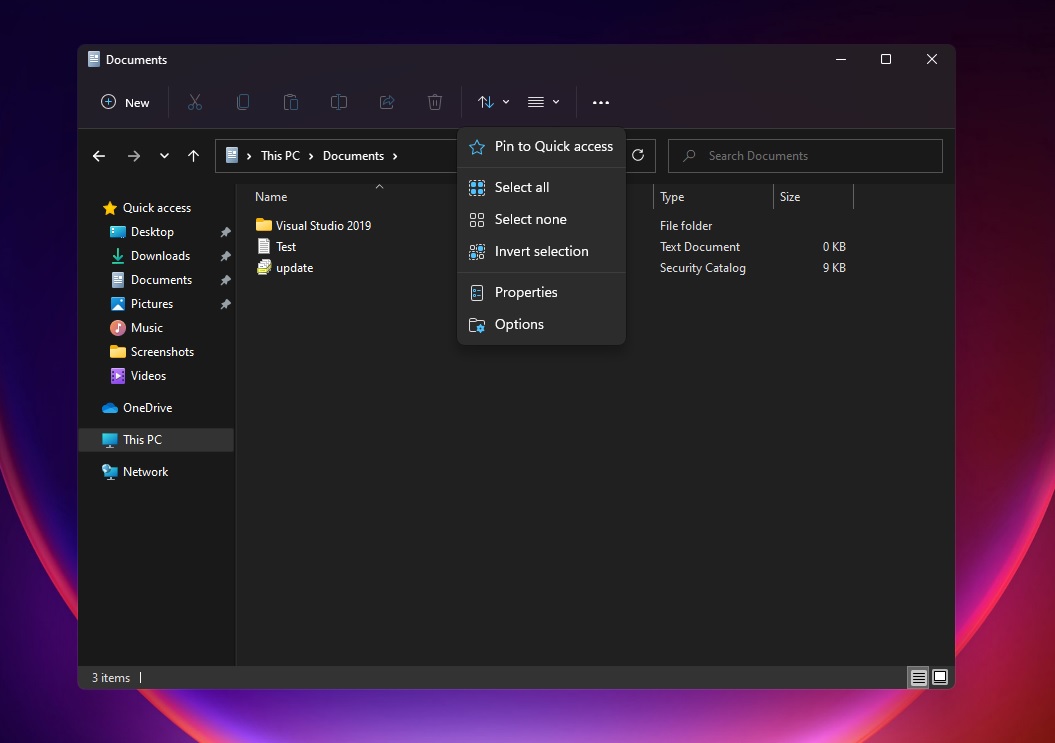
In the preview builds, you can notice the Mica material in File Explorer, Settings, Microsoft Teams, and several other locations.
Fluent Design’s acrylic is densely translucent and its transparency effect is visible behind the app windows or desktop background. On the other hand, Mica updates the app windows to incorporate theme and desktop wallpaper, and paint the background.
In a new question & answer session, Microsoft explained that Mica material doesn’t save desktop wallpaper every frame. Instead, “it only blurs the image once” to offer better performance and experience than Acrylic.
“Performance is really a top priority for us and we want to ensure that all these fun new functionalities (Mica and rounded corners) are super fast and don’t impact the OS. For example, Mica was specifically designed for higher performance when compared to things like acrylic.
“For rounded corners, we optimized our rendering performance so you shouldn’t notice any difference compared to square corners,” the company said.
Microsoft is not copying Apple
Some people believe that Windows 11’s design elements like centered Start Menu and rounded corners are inspired by macOS. This is not true, according to Microsoft.
“Good design tends to be similar we learn from each other but Fluent has been around
a long time and we’re evolving with how people use our device,” said Kevin Gallo, head of the developer platform at Microsoft.
“You know that’s changing all the time as we just kind of use devices in new novel ways and combine them… “You know they might look familiar but our goal is that these things really do you know feel natural normal,” he added.
The implementations of WinUI controls, Mica, and new Fluent Design elements have started with Windows 11 version 21H2 (October 2021 Update), but we’re far from it being complete.
Windows is in the midst of a big redesign and it will take several updates to fully realize the potential of Fluent Design.


")


")
