

")


")


Earlier this year, Microsoft accidentally confirmed that it was working on UI improvements for Windows 10 and references to inactive codes were spotted in the preview builds. Now, we’re finally seeing those internal codes put to good use as a fresh update has rolled out to testers in the Insider program to give the desktop platform a polished new look.
In the recent preview builds, there are two primary changes. For one, rounded corners are now more noticeable. Microsoft has also introduced new icons that you’ll find almost everywhere. This extends to the Settings app, Control Panel, File Explorer, and various app windows.
As with most Windows 10 preview builds, there’s nothing all that major in this week’s update. The overall layout of the operating system is roughly the same as it’s been since the last big feature update (Creators Update). However, Microsoft has spent some time updating the basic UI elements to make things look a bit more modern.
Microsoft is planning to update the default font system.
As you may be aware, Windows 10’s default system font is “Segoe UI” and it is used across all applications, such as Control Explorer, Explorer, Settings, etc.
Segoe UI looks pretty nice. However, Microsoft believes that there’s still room for improvements.
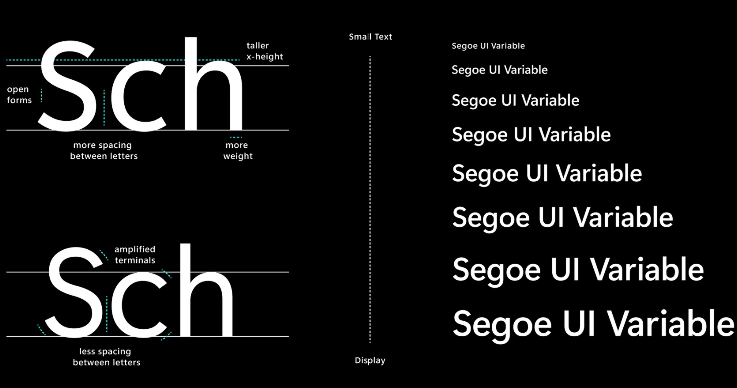
In the next update, Microsoft is updating the default Segoe UI to include an “optical axis”, which should allow the fonts to scale seamlessly on various form factors. For instance, Microsoft seems to have improved the legibility at small sizes, and outlines will look better at display sizes.
By default, Windows 10’s Segoe UI is designed to work at 9pt font size. Font expressions are limited at large sizes and the current implementation also lacks legibility at sizes smaller than 9pt.
In the next version, Microsoft’s Segoe UI font UI will dynamically adjust across all your apps and devices and offer great legibility at different sizes, which includes fonts smaller than 9pt. The style and outlines will also get better at large sizes.
These changes would be noticeable in the Settings and other Windows apps.
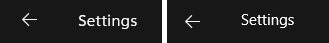
For example, as you can see in the above screenshot, the “Settings” text on the app title bar does look cleaner than the current font on the right side.
It’s worth noting that Microsoft is slowly moving to the new Segoe UI Variable and it will be implemented over time. At the moment, the new fonts are noticeable when you look closely at the title bar of the UWP apps.
")


")


")
