


")
")

 and it removes old modem drivers")

It’s no secret that some parts of Windows still look like they belong to an entirely different era. Fortunately, the company has finally acknowledged it and is also fixing it.
In a recent discussion on X, March Rogers, Partner Director of Design at Microsoft, responded to feedback about an outdated input method switcher that still uses a Windows 8-style design. The issue was raised publicly, with Diego Baca, Windows Design Director, also part of the thread, and March confirmed that the element has been added to their internal “craft list,” which means it’s actively being worked on.
To be fair, Microsoft has already refreshed a lot of visible UI across Windows 11. Most Settings pages, dialogs, and system apps now follow a consistent design language. But the deeper you go, especially into system-level screens, recovery environments, and older components, the cracks start to show.
The real problem lies in the legacy UI that still exists underneath, untouched for years. And the input switcher is a comparatively modern example of that…
Microsoft confirms Windows 8-era UI elements are still present (and being fixed)
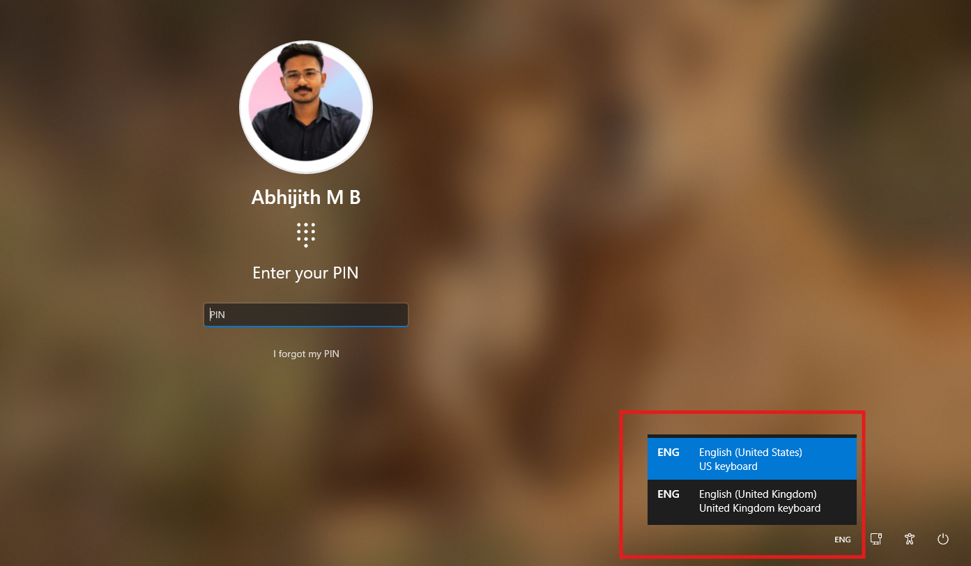
The input method switcher, which appears on the login screen, still uses a rigid, square design that dates back to Windows 8. It doesn’t follow the rounded, fluent design language that Windows 11 uses everywhere else.
This is one of the first UI elements users with multiple keyboard layouts interact with, even before signing in.

A user posted the feedback under Diego Baca’s quoted repost of Pavan Davaluri’s original post about fixing Windows. Microsoft didn’t ignore it. Diego replied directly, promising to pass the issue to the team working on the Login/Lock Screen.
March Rogers was later tagged, who then confirmed that the issue is already being worked on. Two top-level leaders involved in the thread further prove that Microsoft’s team to fix Windows 11 is serious about all the feedback that they’re collecting from users.
However, there are still several parts of Windows that clearly originate from older versions.
Windows Recovery Environment, or WinRE, continues to use an older UI framework that hasn’t been updated to match Windows 11.

The familiar “Please wait” screen with rotating dots, introduced back in the Windows 8 era, is still part of the boot experience today.

These components exist in parts of Windows that operate before the full OS loads or outside the regular desktop environment. Boot sequences, recovery tools, and authentication flows depend on low-level system components, which makes them harder to redesign compared to standard apps or settings pages. That’s why they’ve stayed the same for so long.
Sadly, Windows 11 still carries decades-old UI elements from multiple generations layered on top of each other.
Windows 11 has UI from Windows 10, Windows 8, and even older versions
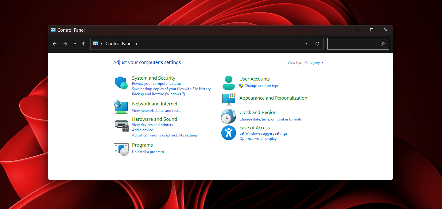
The most obvious example is the split between the Settings app and the Control Panel. The Settings app has the modern Windows 11 design, but the Control Panel is still required for a lot of things that actually matter. Advanced network configurations, detailed device management, and several system-level options still redirect you to legacy pages.
That said, as we reported, Microsoft is slowly moving things over from Control Panel to the Settings app, but this can’t be rushed because of driver dependencies and hardware compatibility.
In File Explorer, the Properties dialog still uses an older layout. Even the context menu is a hybrid system. You get a modern right-click menu first, but the moment you click “Show more options,” you’re thrown back into the Windows 10 context menu.

A pet peeve of mine is that I wish Windows 11 had modern icons for folders. I have a ton of folders, and I wish to give meaningful icons to them, but unfortunately, Windows 11 has icons from Windows 3.0! Truth be told, at this point, I expect to create custom icons for folders with the help of Copilot.
Then there are the multitude of system tools and dialogs that never got the Windows 11 treatment.
The Run dialog still looks the same as it did years ago. Registry Editor continues to use a legacy layout with no visual alignment to modern UI. Device Manager hasn’t changed much either and still feels like a Control Panel extension. Disk Management is another one, with its old-school interface and layout.
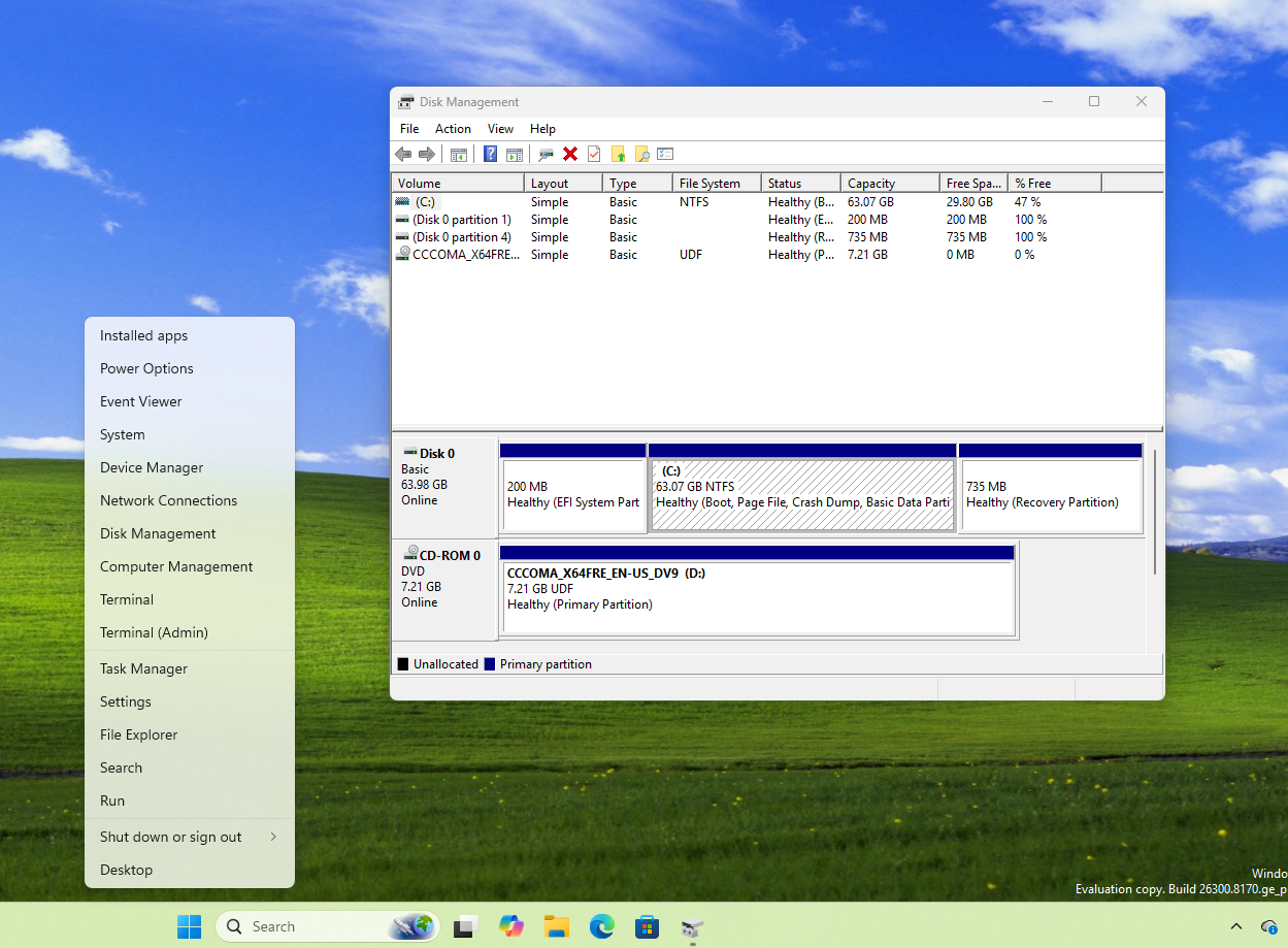
All of these are fully functional and very important tools, to be honest. And all are visually disconnected from what Windows 11 is trying to be.
But at the same time, it’s hard to fully blame Microsoft because, unlike macOS, Windows has always prioritized backward compatibility. It supports older drivers, enterprise tools, and workflows that depend on these components. Rewriting everything at once isn’t practical.
Microsoft is clearly aware of this now, and the recent responses from its design team suggest that fixing it is finally becoming a priority.
Windows 11 is finally cleaning up its past and present
Unlike how the company did with Windows 10, Microsoft is no longer ignoring legacy UI issues. Something as small as an input switcher getting attention says a lot about where things are heading.
Windows 11 is slowly moving toward a more consistent design, and in doing so, it’s starting to address years of visual and structural baggage that built up over decades.
Also, Microsoft is cleaning up Windows 11’s reputation by bringing a whole bunch of improvements and features to the OS, starting with stuff like a movable taskbar and File Explorer improvements.


")
")

 and it removes old modem drivers")
