


")
")

 and it removes old modem drivers")


The Windows 11 November 2025 update brought with it a completely redesigned Start menu, to the point where it is the most customizable version, while also occupying a majority of the screen when you click the Windows key.
Yes, the Start menu is now considerably larger than it used to be, and we believe that this is a conscious decision now that the Start menu has a single page with the full app list as well.
In our tests, Windows Latest found that the Start menu now takes about 90% of the vertical screen space, which is a huge jump from its previous 50% to 60%. Also, if you have Phone Link enabled on the Start menu, then it takes the entire screen.
If you don’t see a change in the Start menu even after installing the Windows 11 KB5068861 update with Build 26200.7171, then it’s likely because it is a gradual rollout, and if you aren’t a fan of disproportionate design, enjoy the old Start menu while it lasts, because after getting the new design, you won’t be able to go back.
Windows 11’s November update made the Start menu more customizable
The November update completely changes the way we use the Start menu, and considering that Windows users generally hate the idea of changing their habitual actions, it could go both ways.
However, Microsoft has done a commendable job with the new Start menu design in isolation. There is now a single unified space that shows pinned apps, recommendations, and your entire app list without having to switch between screens.
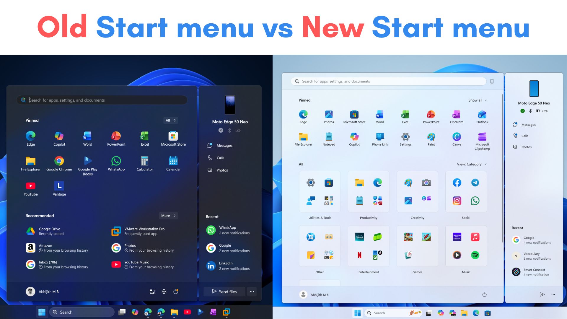
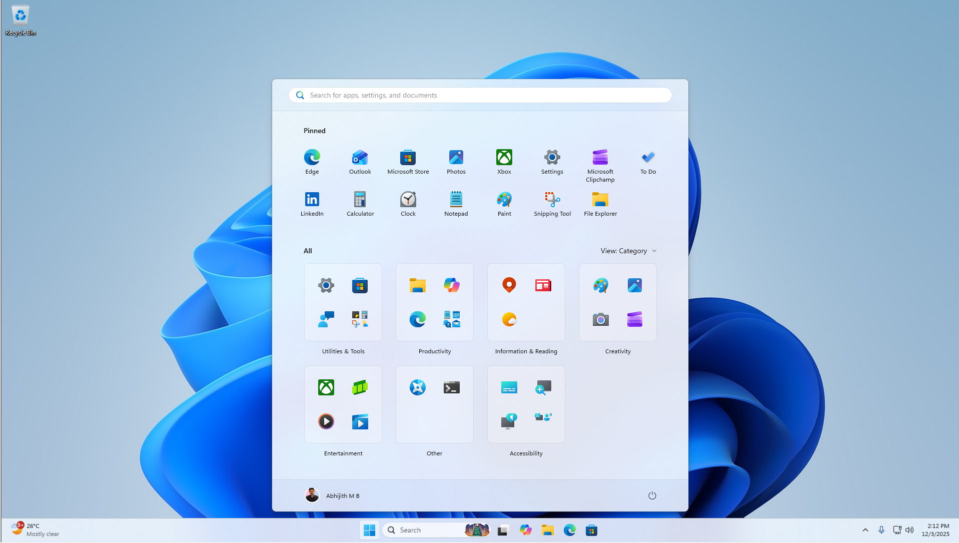
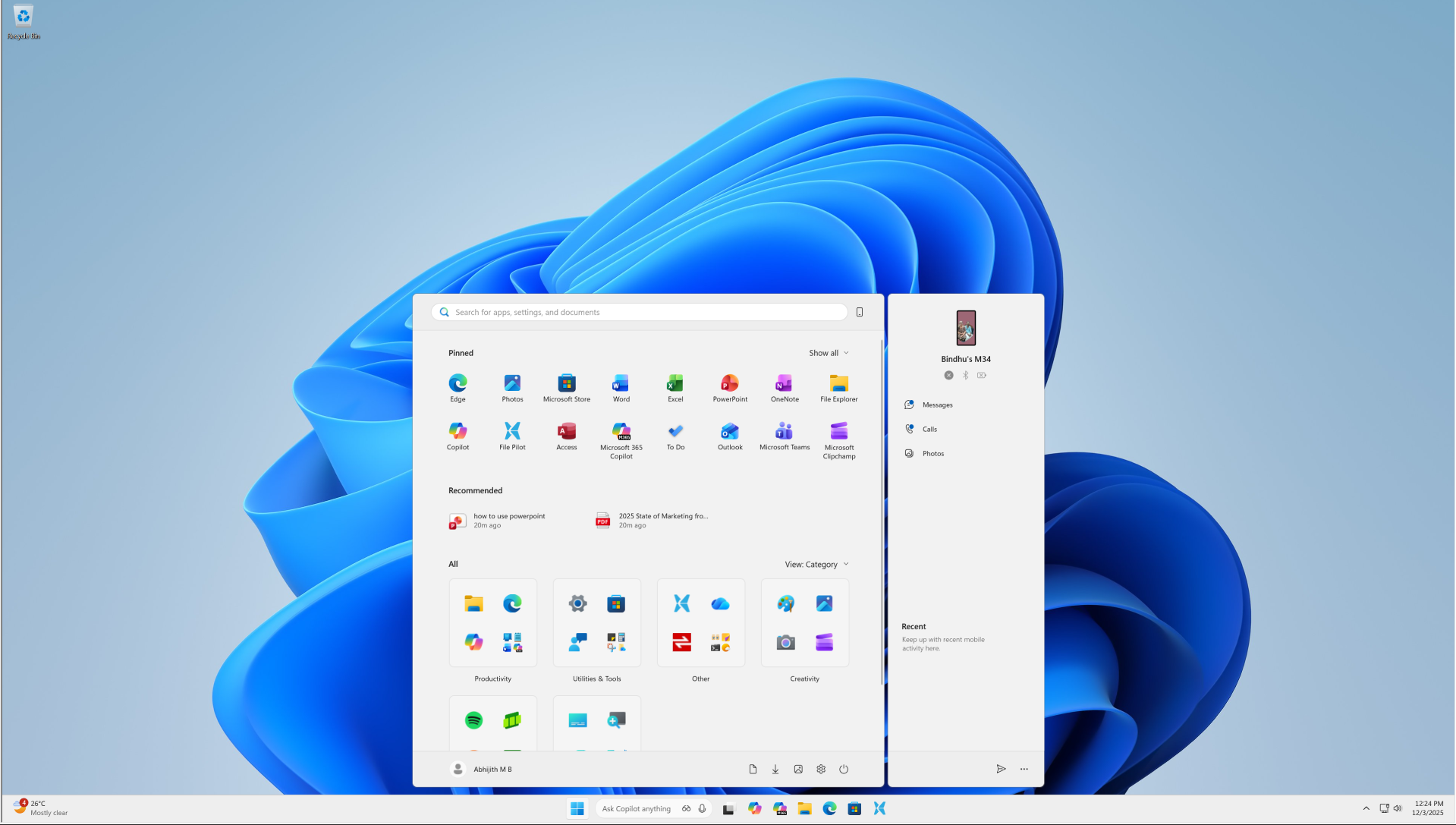
After the new update, by default, you’ll see the new Categories view, which groups your entire app list into sections like Productivity, Entertainment, Utility & Tools. You can change this to the Grid view, which tries to mimic how Android and iOS show app icons, albeit with a lot of wasted space.
Of course, there is the usual List view as well. But these aren’t the only customizations that the Start menu has. You can now get rid of the Recommended section, which you couldn’t do before, meaning you should get more useful space in the Start menu and make it compact.
Also, on larger monitors, the Start menu expands automatically to show more pins and recommendations. It depends on your display size and resolution. So, technically, you should be able to see a compact Start menu. However, that’s not the experience we got in real life.
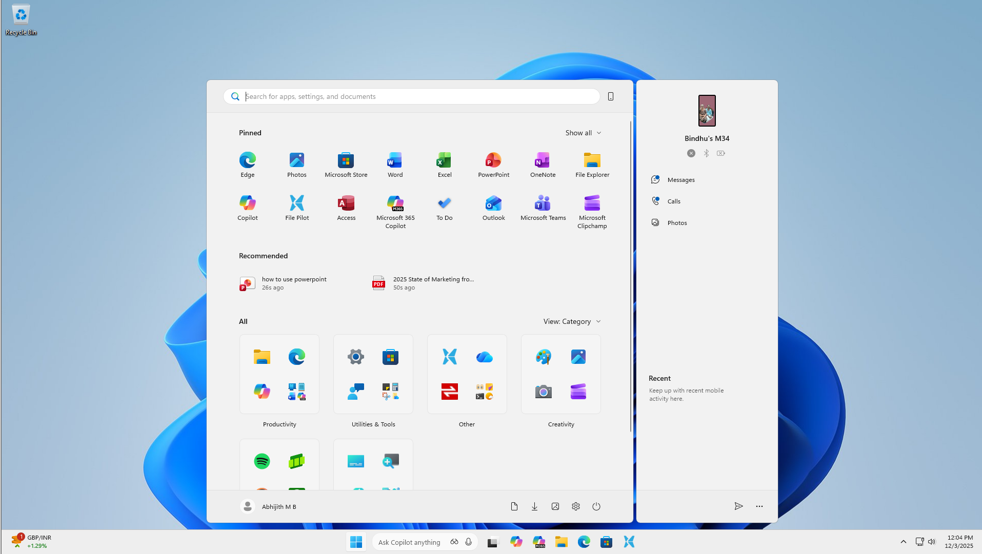
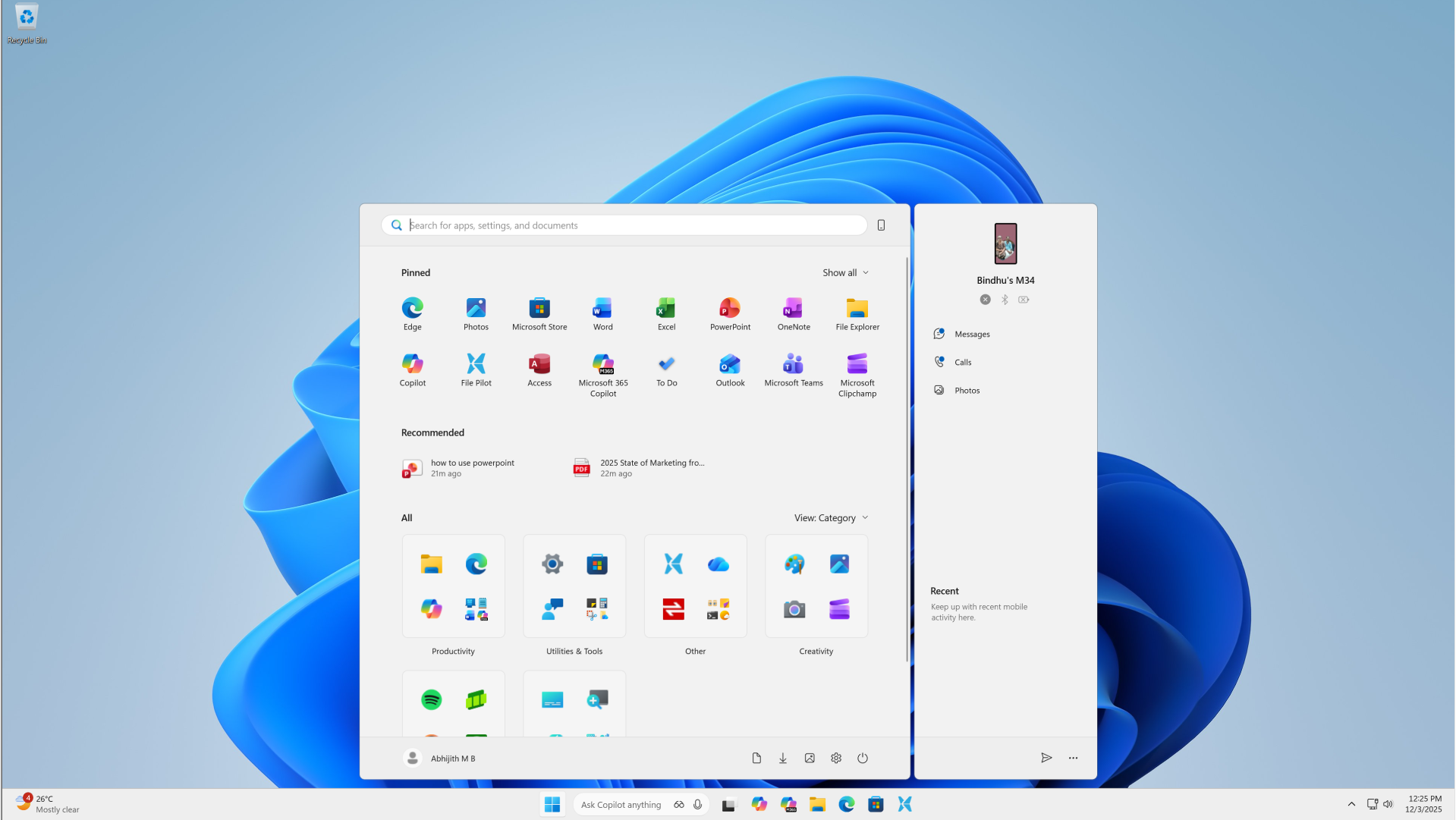
The new Start menu takes up more space than ever before
After the update, this is how the new Start screen looks on a 14-inch screen with a resolution of 1920 x 1080, and the Scale set to 100%:

It’s clear that the Start menu takes too much vertical space. On a very common 16:9 aspect ratio like this, it already takes around 90% of the vertical height.
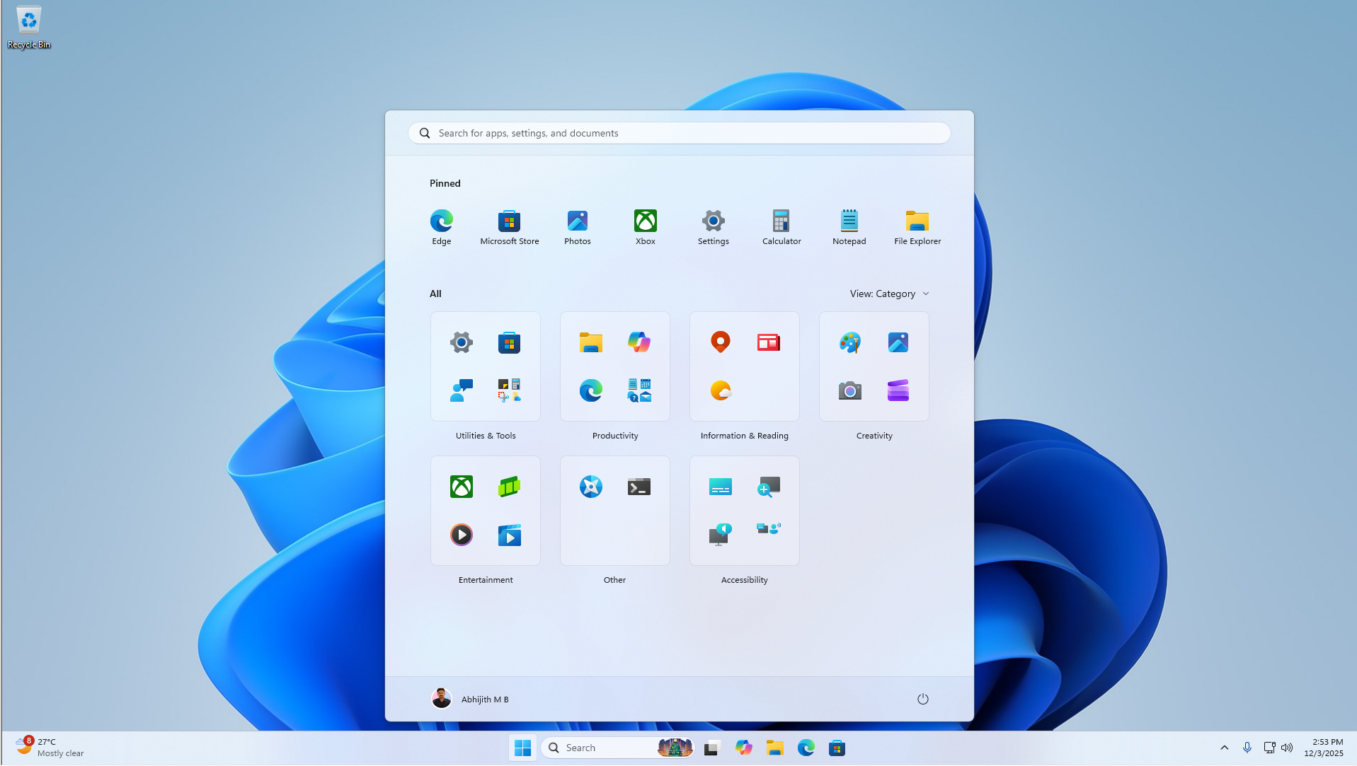
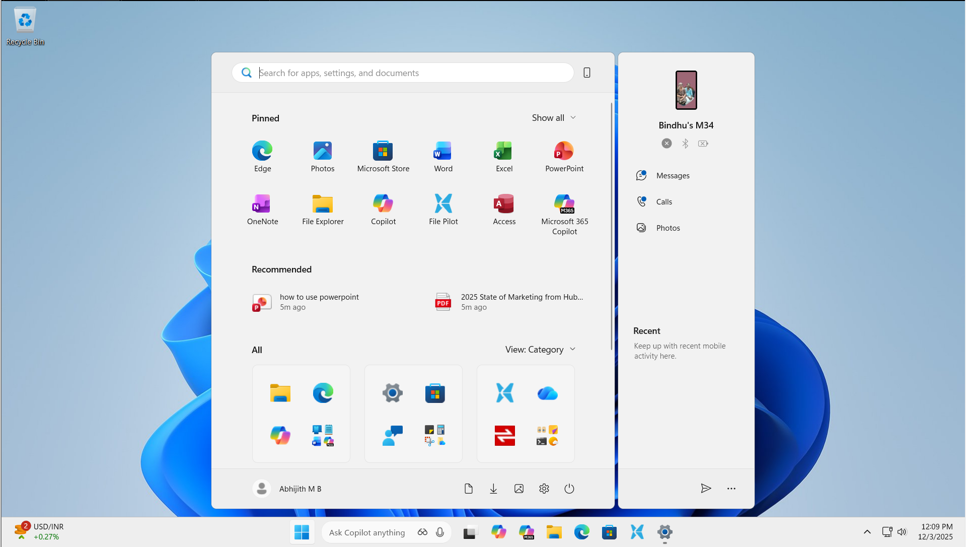
Of course, you might think that it’s due to the Recommended section that takes an extra line. Fortunately, you can completely turn it off, but that simply shows more of the app view. So, turning off the Recommended section does nothing to reduce the Start menu’s size.
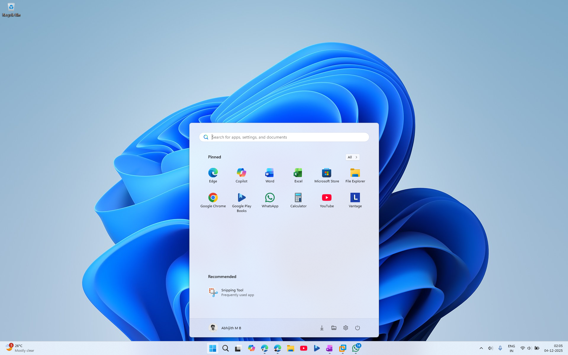
You can argue that the large size might be due to the two rows of pinned apps, and removing one row should make the Start menu more compact, right?
Well, I have removed one row of pinned apps, and the Start menu still has the same height. This time, you can even see wasted white space on the bottom, below the All apps view.
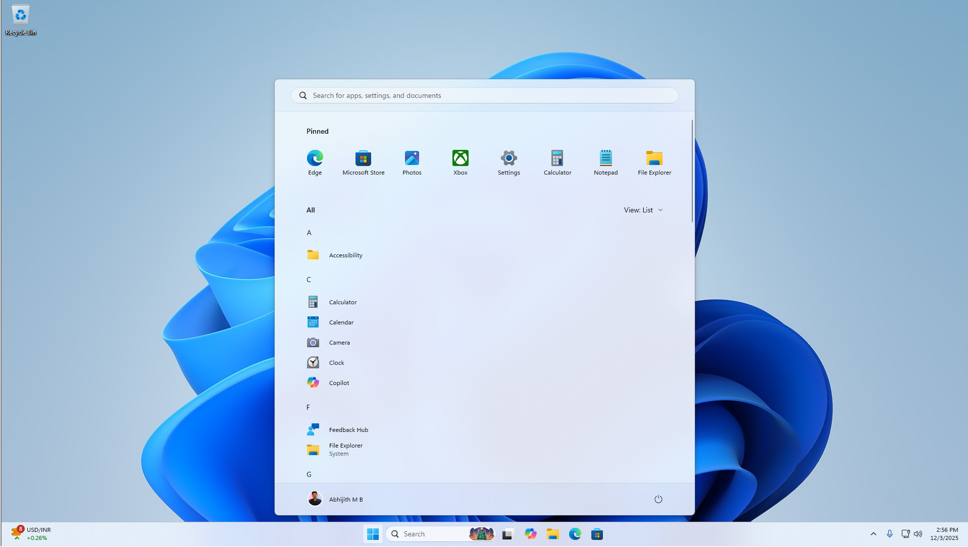
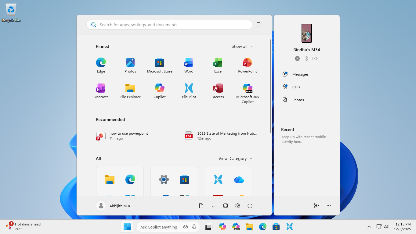
But what if the large size is due to apps in Category view? Surely it is supposed to become smaller if we use a list view or a grid view.
Not really, as changing to List view or Grid view does absolutely nothing to the height of the Start menu. And despite Microsoft claiming that the Start menu dynamically adapts to screen size, we haven’t noticed it in practice.

All this is accentuated if you show your mobile device on the Start menu, taking even more of the screen.
Some people like apps and text to be bigger on their screen, as it improves legibility, so if you happen to go to a larger scale, like 125%, the Start menu takes even more screen real estate.
If you have a lower resolution display, like 720p, with 100% scale, the Start menu almost touches the top of the screen.
But if you have a 4K screen, you’re in luck, as the Start screen appears to shrink to almost 60% for the better in a 4K screen with a Scale of 150%. Of course, you would need a bigger screen here to read the text, and my 14” one isn’t enough.
Realistically, it would be better to go with a 175% scale for a 14” 4K Screen, as it slightly shrinks the Start menu.
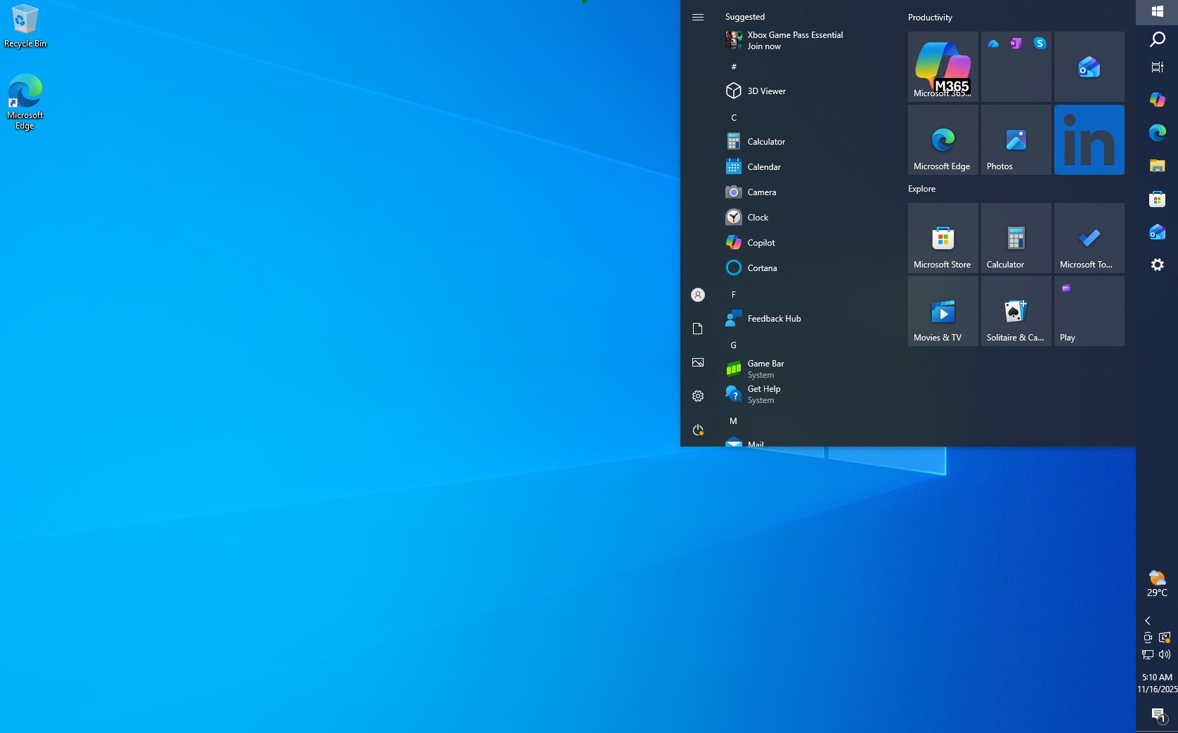
By this time, if you have forgotten what the Start menu used to look like, here is a reminder:
Yes, it is much smaller than the newer one. However, it’s not perfect in its choice of space either, especially if you manually remove recommended apps or files to show up on the Start screen, there will be a lot of wasted space.
So, after installing the latest updates to your PC, we recommend that you play around with the Scale by going to Settings > Display > Scale. Keep your resolution to the maximum that your display supports. You can also adjust the Text size, if it is too small or large, by going to Settings > Accessibility > Text size. This will help you find the perfect size for the Start menu, or at least the least worst one.
Speaking of perfect, did you know that you could actually resize the Start menu in Windows 10?
The Start menu in Windows 10 was better in a few ways
Yes, the size of the Start menu was never really an issue with Windows 10, since you could literally resize it by dragging from the edges.
Naturally, you can make it smaller or larger to your heart’s content. However, the part that makes the Windows 10 Start menu better than Windows 11’s is that you can have it on any side of the screen.
In fact, the ability to change the position of the Taskbar to a vertical one is one of the most requested features for Windows 11, so much so that even the Fortnite creator, Tim Sweeney, has urged Microsoft to bring back the feature.
But now, we’re at a point where giving the ability to change the taskbar or Start menu positions is too hard for Microsoft to achieve, as they are adding more and more features to the Taskbar experience, like the recently announced Agent mode in the Taskbar.
Similarly, we believe making the Start menu smaller or more compact might not be in Microsoft’s list of priorities at the moment, with the simple reason being that it is hard.
Of course, they could try using Copilot to code a compact Start menu, especially since Copilot can code faster than a human drinks coffee.
Jokes aside, I like that we can customize the new Start menu with different app views, but the Start menu taking almost double the size is not exactly an efficient design.
Either way, the update has already rolled out to all users since November 2025. Since it is a gradual rollout, it might take some time for your PC to get it. If you have already used the new Start menu, does the fact that it takes more space bother you? Tell us in the comments below.


")
")

 and it removes old modem drivers")

