


")
")

 and it removes old modem drivers")

Four years after its launch, Windows 11 is exploring a major update to the Context Menu, at least for some apps. It has every ingredient to finally fix what users have been complaining about. Microsoft calls this new UI update for the right-click menu in WinUI 3-based apps, and the feature is called “Split Context Menu.”
Microsoft won’t clarify whether this idea will be applied to the shell or remain limited to WinUI apps for now. If it’s applied to the shell, it’ll be available everywhere in Windows 11. If not, you will only see the new menu in some apps.
Microsoft confirmed the upgrade in the WinUI Community call spotted by Windows Latest.
When you right-click on a file or folder in any app or Windows, the menu that shows up is called the context menu. Its purpose is to provide quick access to relevant actions based on what you’re interacting with. But lately, this menu has gotten a little too useful with too many options.
Microsoft admits that the current right-click menu makes the context menu appear cluttered with a long list of actions, something that has been bothering users for a long time. Also, you might have noticed that when you right-click a file, you’ll likely see irrelevant or excessive “contextual” actions that could’ve been avoided in the first place.
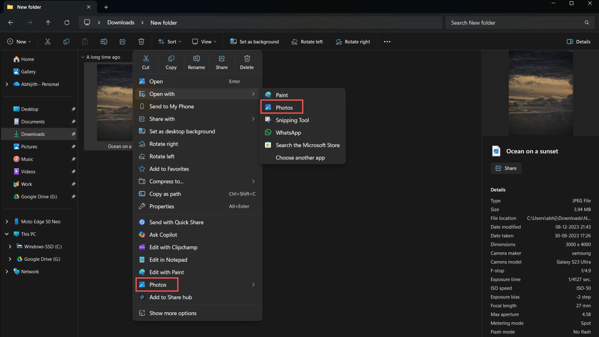
Here, while right-clicking on an image, even though there is an option to open in the Photos app, you can see the Photos app mentioned two more times in the context menu. Besides that, there are other options down below, which could frankly be integrated into the “Open with” menu.
This is a system-wide problem, which means menus in WinUI-based apps like the Microsoft Photos app are also taller.
Well, Microsoft’s solution is to add context-aware nested menus, based on the type of file, which ideally would reduce the length of the context menu, while allowing developers to add useful secondary actions. This change will first arrive in WinUI-based apps, but Microsoft won’t clarify if it will eventually arrive for all menus in Windows 11.
This means all Photos app-related options will now be grouped under “Open with Photos” and the secondary menu will show all related options when you hover.
What is the Split Context Menu?
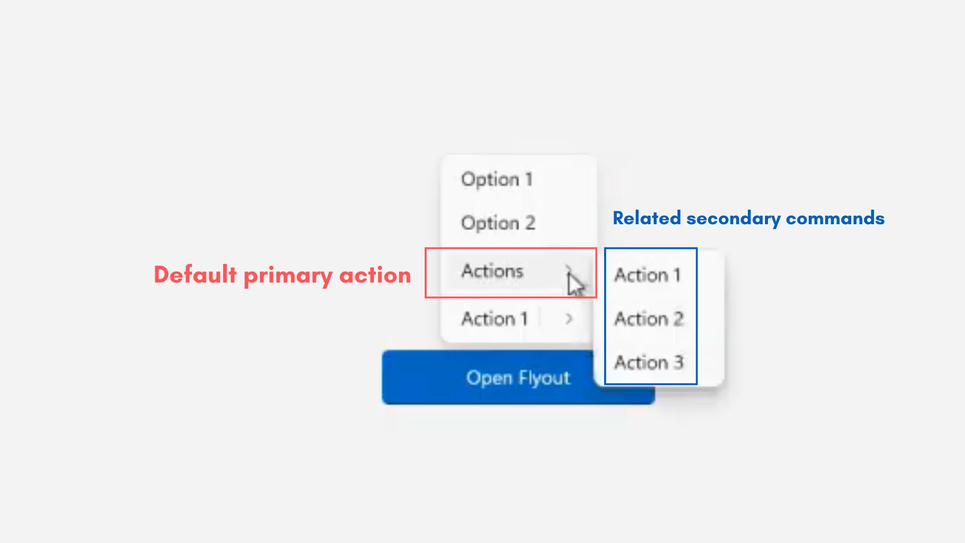
The Split Context Menu in WinUI apps aims to make the right-click experience more intuitive, organized, and context-aware through a new API called SplitMenuFlyoutItem, which allows a single menu entry to contain both a primary action and secondary options, shown in a separate, smaller flyout beside the main item.
For users, instead of seeing multiple repetitive entries in the right-click menu, like Open with Photos, Edit with Photos, and Set as desktop background, they’ll see just one “Open with Photos” option, with related secondary apps such as Paint or Snipping Tool, all tucked into the secondary menu (split menu).
You can hover over “Open with Photos” to see all related options in the secondary menu.
Based on the images shared in the WinUI Community Call, we can safely say that this new UI design solves two long-standing problems. The first is that it prevents menus from stacking similar items into a single vertical list.
The second is that it makes options more adaptive and shows only the options that are relevant to the selected file.
Developers can also define which action appears as the default and group less-used or advanced tools under a small arrow next to it.
How the new secondary (Split Context) menu works
The new Split Context Menu is powered by a WinUI 3 control called SplitMenuFlyoutItem, which is a part of the latest Windows App SDK. This new control changes how context menus are rendered inside WinUI-based apps by letting a single item behave both as a primary action and a secondary menu container.
When a developer defines a SplitMenuFlyoutItem, it acts as a hybrid of a button and a submenu:
- Right-click on an image, and the context menu appears. It has a “Photos” option, which is the primary action.
- Then, Microsoft is adding a nested menu, which lets you access all Photos-related commands or apps (Paint, Snipping Tool). This second menu can be accessed by hovering over the Photos option in the primary context menu. Right now, all these apps and options are repeated several times in the primary menu.
From the demo, it is clear that the new control supports context-aware grouping. That means Windows apps can now dynamically determine which secondary actions to show based on the file type.
When a .txt file is right-clicked, Open with Notepad appears as the default, with other editors hidden in the secondary menu, which can be accessed by hovering “Open with Notepad.” This reduces repetition, as you just have “Open with Notepad” in the primary right-click menu, and everything else shows up only when you hover over the Notepad option.
The whole feature may not need extra compute resources, because the contextual actions are added on by developers, who can assign defaults, where Windows automatically promotes the most frequently used app for the selected file type. Developers can also adapt menus per file type, so the same app can appear differently when right-clicking a text file vs an image.
New context menu could reduce clutter by 38% in some cases
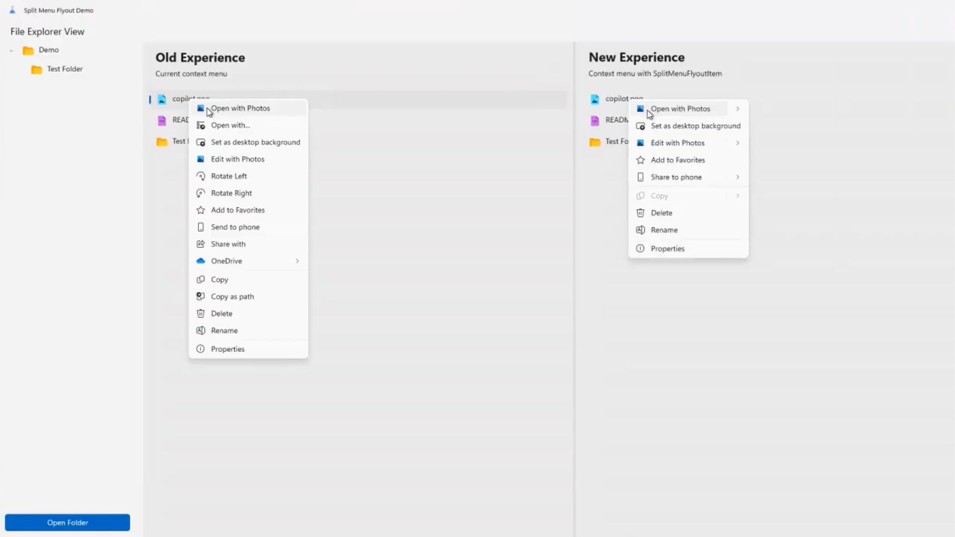
Microsoft’s new Split Context Menu drastically trims the clutter that plagued the right-click menu, with a cleaner, shorter, and potentially smarter layout. As shared by Microsoft developers, the new design reduced overall menu length by up to 38%, but it depends on the file type.
In some cases, the menu shrinks by 35% when groups all related options like Open with Photos, Set as desktop background, and Edit with Photos appear under a single split menu. See the screenshot below.
Since these examples are of WinUI 3-based apps only, they don’t have Cut, Copy, Rename, Share, and Delete buttons.
Text-based files, right-click menu, see only a 30% reduction in menu height, but that in itself is a welcome change. The “Open in Notepad” option will be on top, with any other supported applications under the submenu.
Sharing the file will also be in a single button, with “Share to phone” being the default action, likely powered by Phone Link.

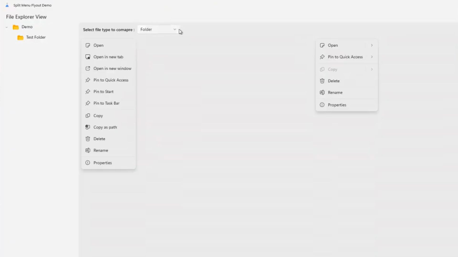
Right-clicking folders gets the most reduction in height, which makes sense because the current layout repeats similar actions like Pin to Quick Access, Pin to Start, and Pin to Task Bar, which all can be consolidated into one default Pin to…option. Unsurprisingly, there are also three separate “Open” options.
But can we expect this new menu to be available everywhere in Windows, such as File Explorer?
While Microsoft examples clearly use “File Explorer,” the “Split view” feature in the question is specifically for WinUI-based apps or menus. This means it will roll out to Windows apps for now, such as Microsoft Photos. However, that could change in the future, as Microsoft might adopt a similar design approach for every corner in Windows 11.
The Split Context Menu is still under an early developer stage and isn’t available in any app. So, any chance for testing for regular users is out of the question.
Microsoft detailed its underlying API in the official WinUI GitHub repository, so developers can already begin experimenting with it by referencing the control through the latest Windows App SDK preview builds.
Right now, there is no word on when the Split Context Menu will arrive for the shell (everything in Windows 11) for everyone.
Microsoft is also working on the long-promised acrylic blur, which is slated to come to every corner of apps in Windows 11. Both these are steps in the right direction for the company, which is finally shifting to benefit regular users rather than its habit of going full B2B.


")
")

 and it removes old modem drivers")
