
")


")

 and it removes old modem drivers")


Microsoft has been rolling out the new Start menu for a while now, but if you still don’t see it, you might finally get it after installing Windows 11 KB5074109 (January 2026 Patch Tuesday). This is a mandatory update, and most of my PCs finally have the new Start menu.
Microsoft told me that it had nothing to share when I asked when the rollout of the new Start menu would wrap up, but the company added that it’s always rolling out changes gradually based on user feedback. And it’s not just the new Start menu. Almost everything in Windows 11 is a staged rollout, including tiny bug fixes.
More recently, Microsoft added ‘Share with Copilot’ to the taskbar alongside new battery icons, but even those changes are not available for everyone as of January 14, 2026.
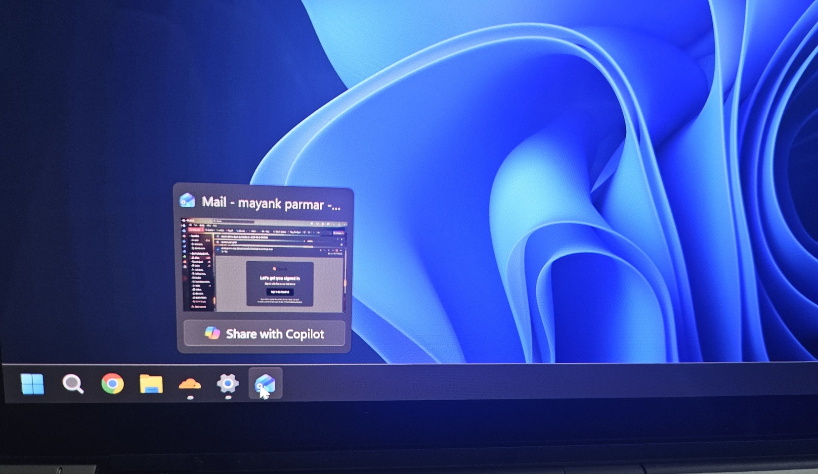
Some of you might begin seeing new colourful icons for the battery on the taskbar, but that’s a different story. Let’s take a closer look at the new Start menu.
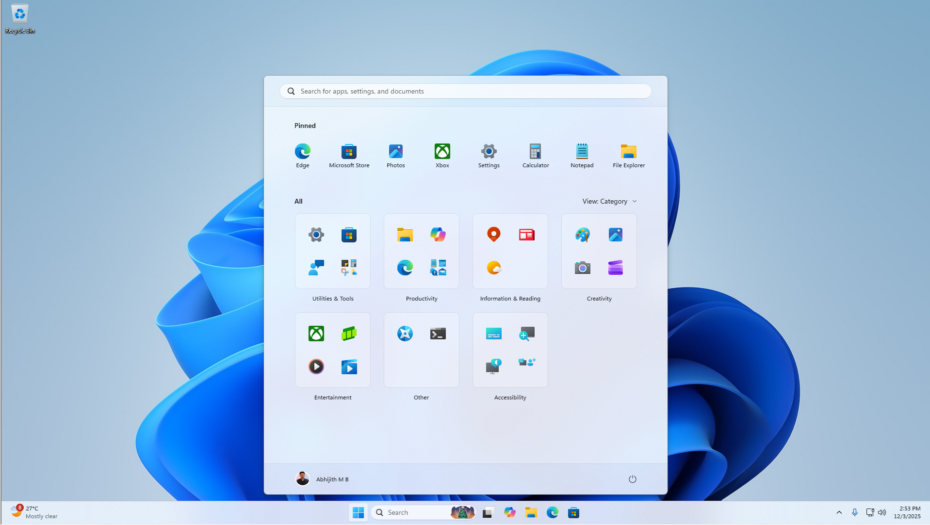
How good is the new Start menu?
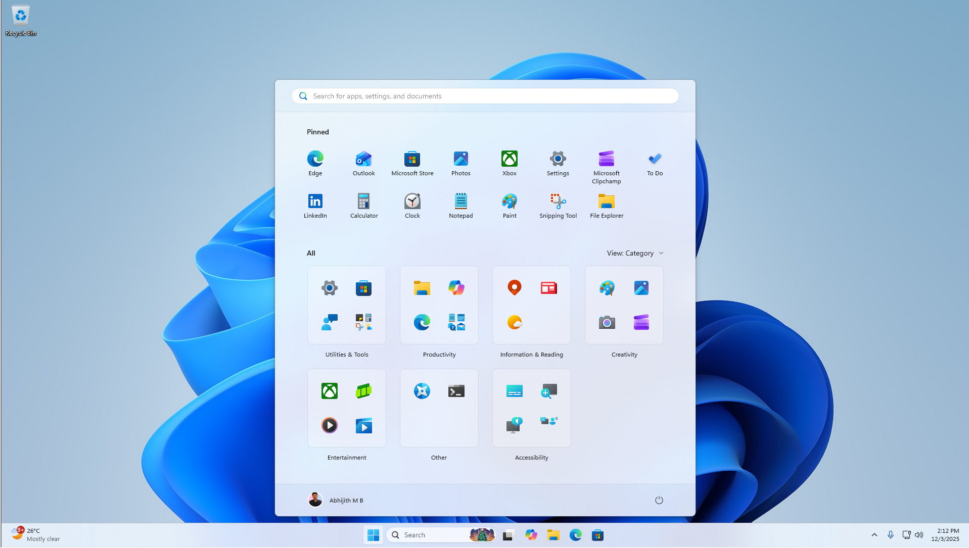
This new Start menu isn’t dramatically better than Windows 11’s original Start layout, but it’s certainly not worse. Unlike the older version, the new Start UI is a single-page layout, so it shows everything on one page under different sections.
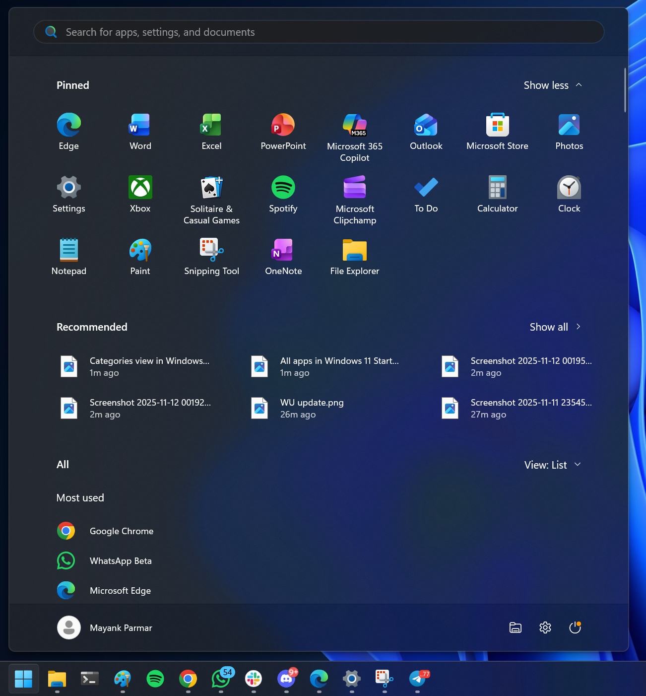
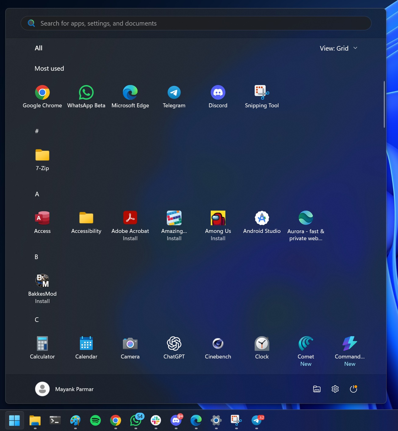
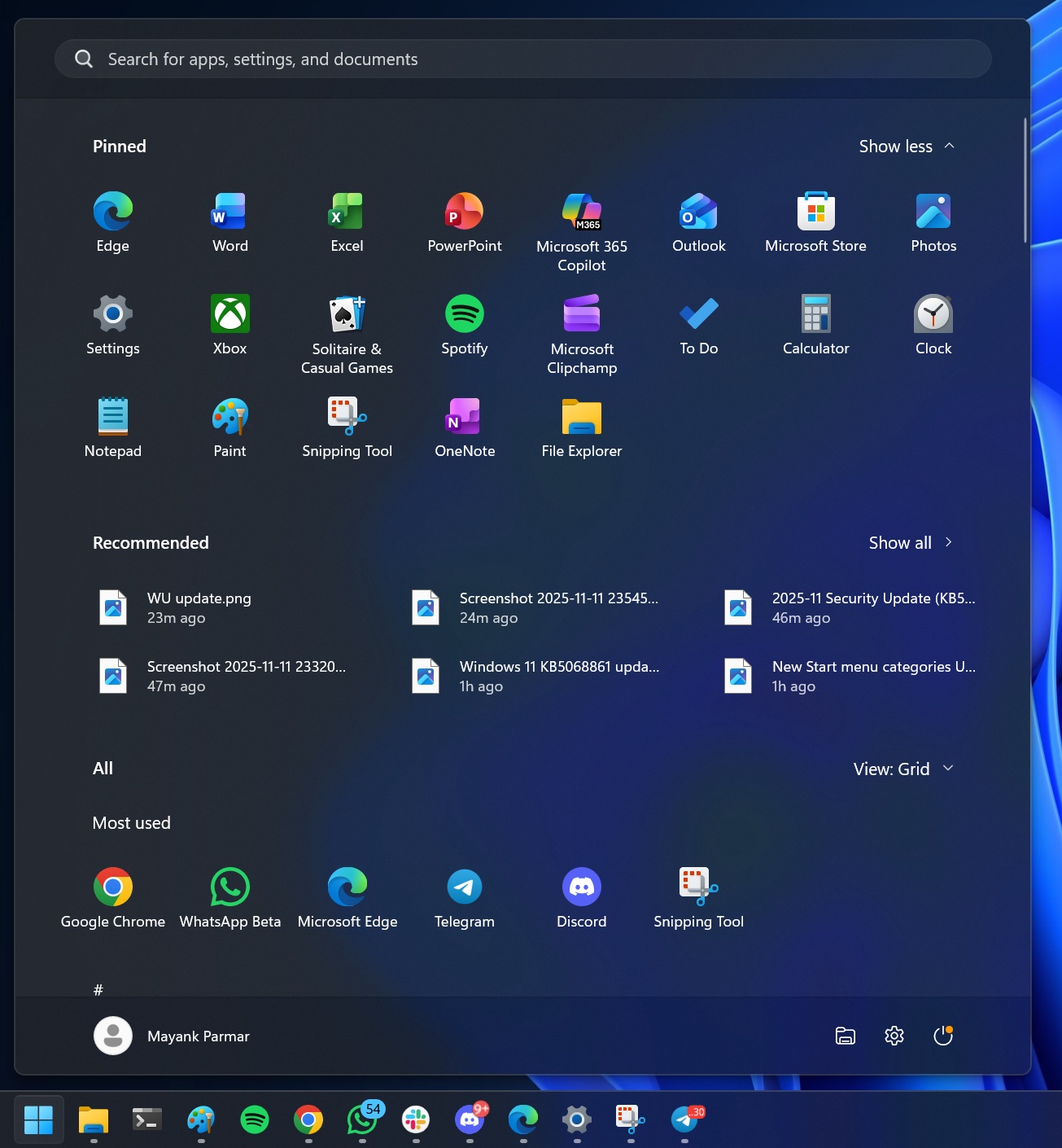
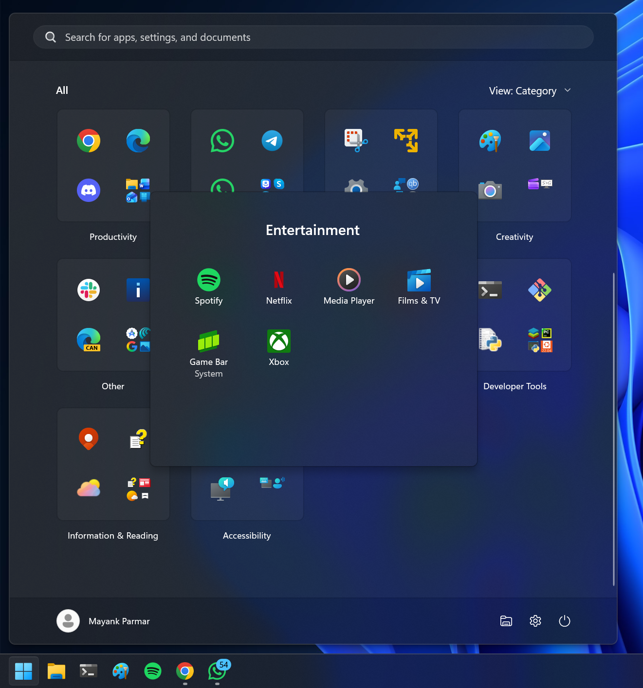
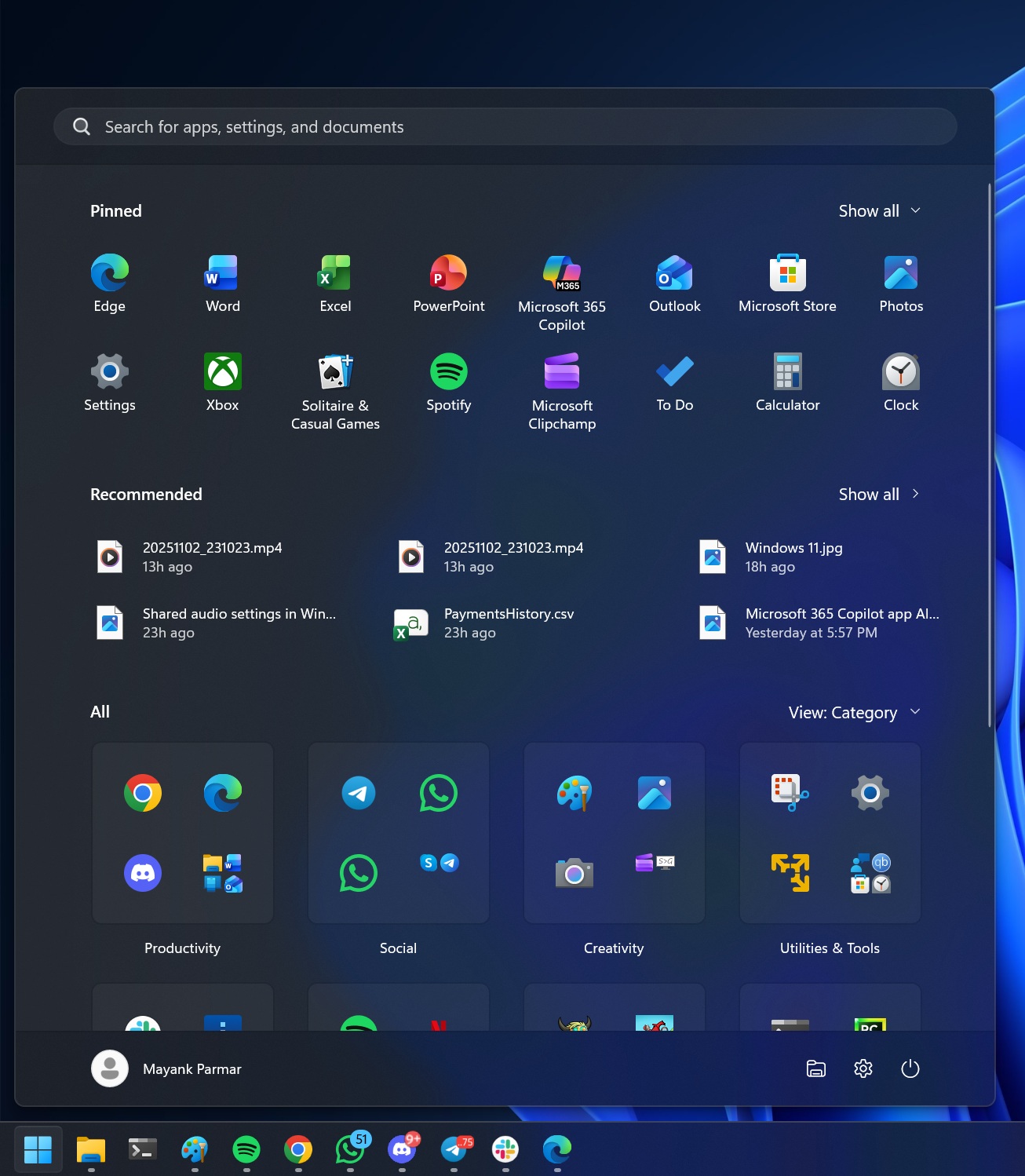
You’ll have your pinned apps first, followed by the optional Recommended section (which can be turned off), and then all apps listed in either a grid or category format. In category format, your apps are grouped under different categories, such as Media Player and Groove Music are in Entertainment, while Terminal and PowerShell are in Productivity.
New UI gives you more options to customize the Start menu, and it addresses the long-standing concerns of users requiring too many clicks to go to the apps list.
But why does the new Start menu look too tall on some PCs?
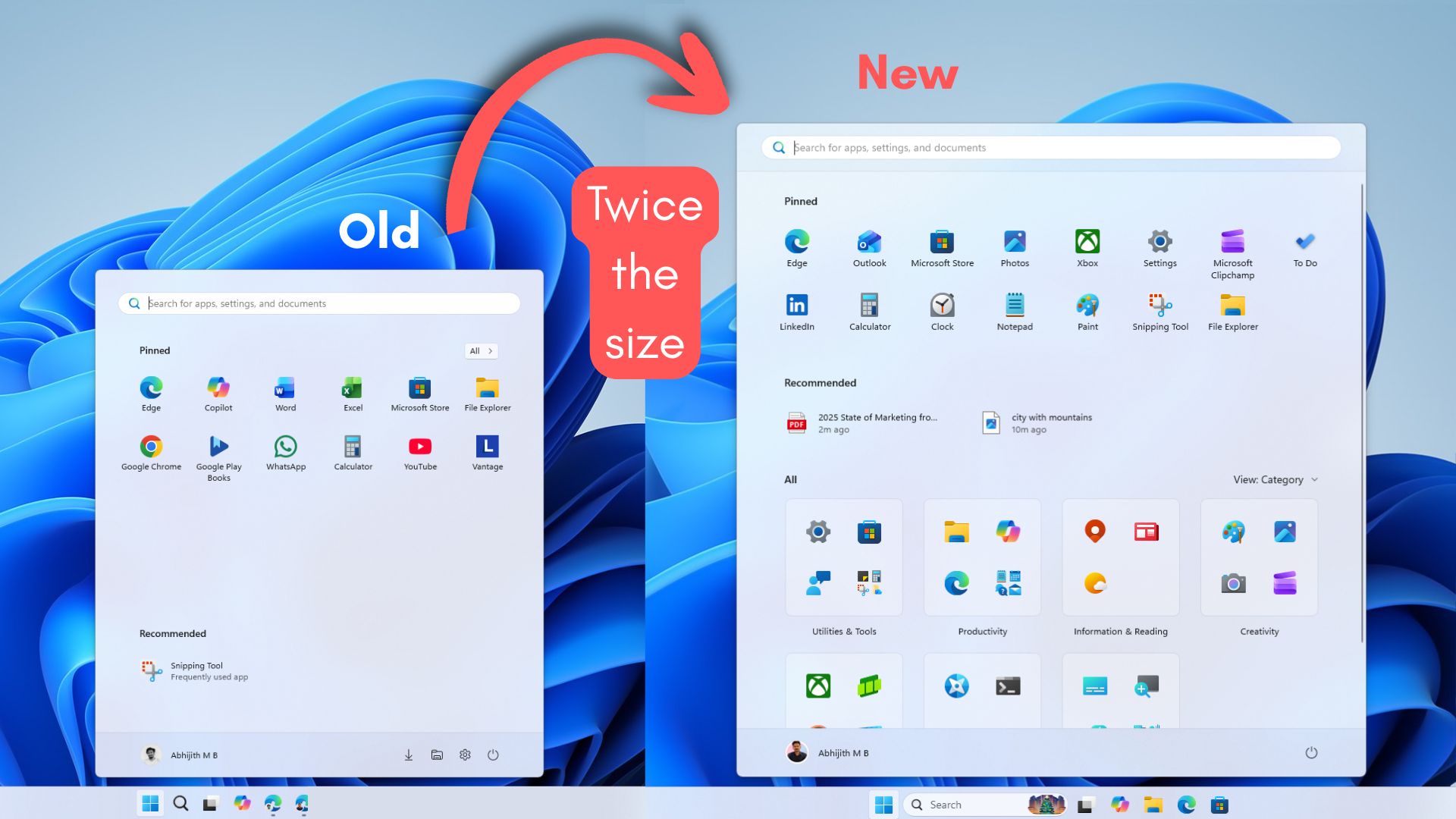
The new Start menu looks “too tall,” mostly because Microsoft redesigned it as a single page, so it needs to fit pinned apps, a recommendations area (even if you turn it off, the space often gets reused), and the full app list in one view.

To stop the layout from jumping around, Windows seems to use a minimum height target for Start, so it always has enough room for headers, category rows, and scrolling content. That’s why removing a row of pins or switching Category, List, or Grid doesn’t really shrink the menu
In our tests, Windows Latest observed that the new Start menu appears to use scaled pixels to determine its size. If a laptop’s resolution is 1920×1080 and 100% scale with limited vertical space, Start can easily eat 90% of the height.
If you bump the scale to 125%, everything becomes larger in effective pixels, so Start takes even more of the screen. On a 4K display, you have far more raw pixels, so even at 150-175% scale, you can end up with more usable vertical space, which makes Start look shorter.
You should experiment with the scaling settings in Settings > System > Display to change the size of the Start menu. But it’s not a perfect solution, which is why I believe Windows 11 needs a Windows 10-style Start resize control.
Unfortunately, Microsoft still has no plans to add a Windows 10-like resizable Start menu, and there are also no plans to let us move the taskbar to the top or left/right sides. Microsoft argues that these features would break the flow of the ‘animations.’
Over to you: What do you think about the new Start menu? Let me know in the comments below.


")


")

 and it removes old modem drivers")

