


")
")

 and it removes old modem drivers")

This month’s optional update (KB5067036) for Windows 11 (version 25H2 or 24H2) has a new Start menu, which is being gradually rolled out. It’s under a Preview tag, which means Microsoft will include all changes from the optional update in the November 2025 Patch Tuesday.
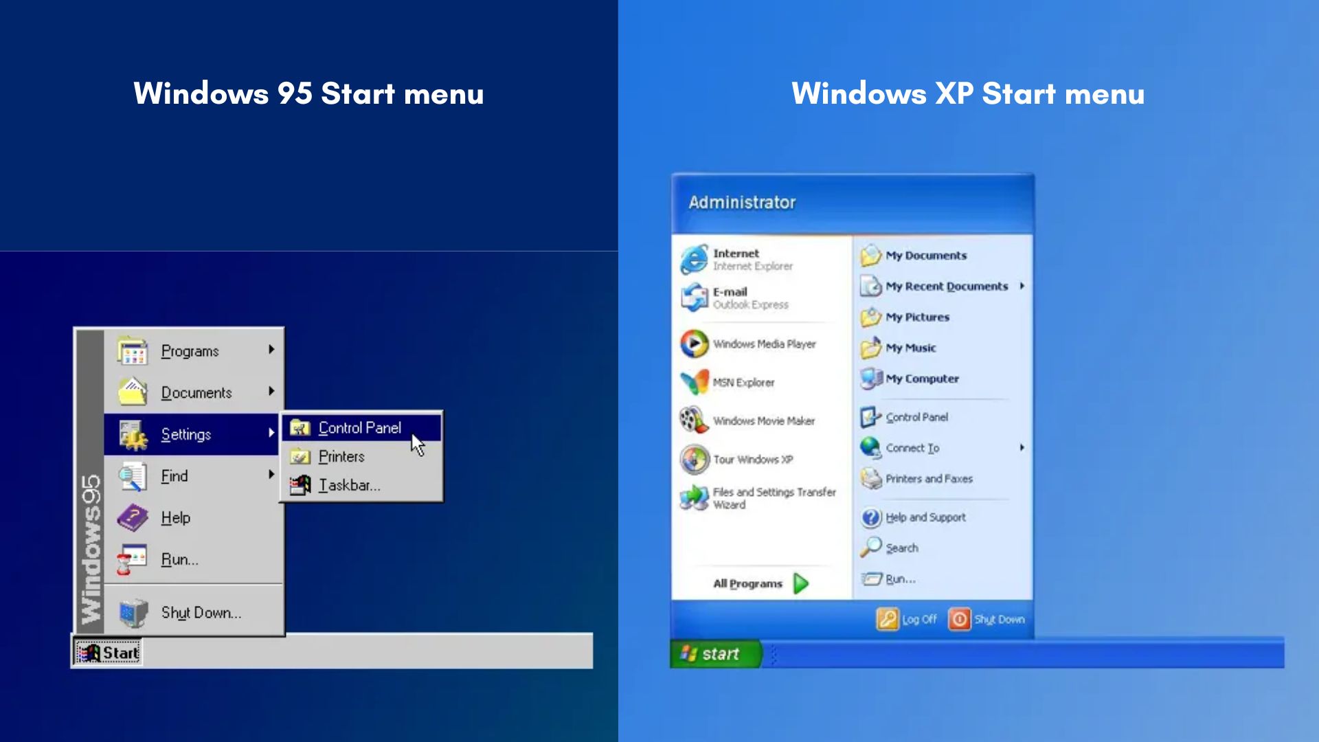
The original Start menu is now 30 years old and was first launched with Windows 95, in 1995 (of course). Then there was a major redesign with Windows XP, but that’s still almost 25 years old.
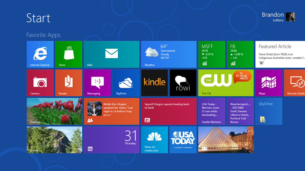
With these many years in development, we’d expect the feature to evolve into something new or get a possible replacement, which Microsoft had tried with Windows 8 in 2012. A full-screen Start screen with Live Tiles was way ahead of its time, and even as I criticized Microsoft back then, along with millions of users, now I wouldn’t dare to question the beautifully crafted Start screen design in Windows 8.
Microsoft was quick to understand its mistake and brought back the classic Start menu (with resizable Live Tiles) in Windows 10, which has now reached its end-of-life. However, the Start menu, which reached its peak popularity with Windows 7 in 2009, continues to live on with Windows 11.
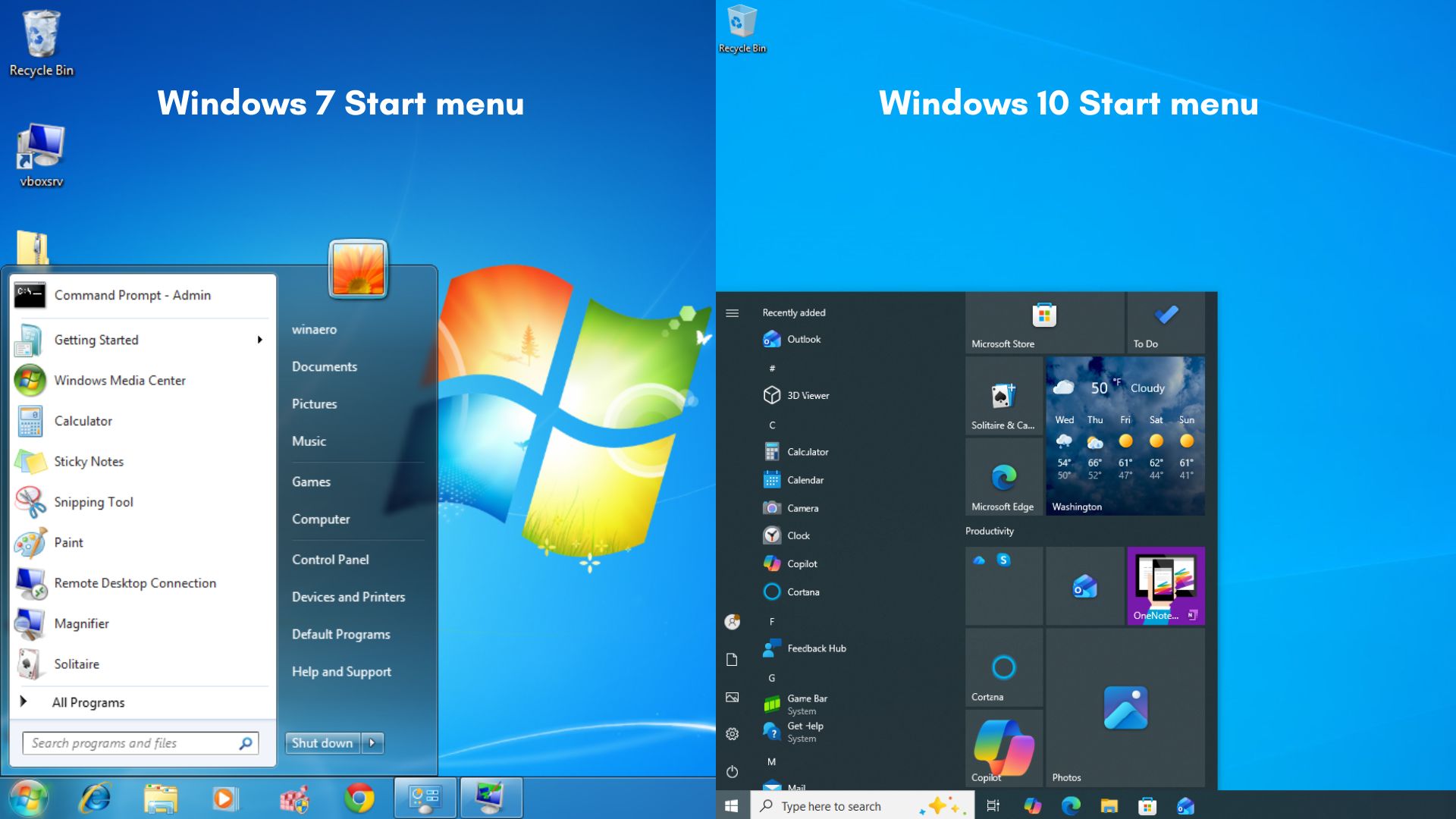
While the Windows 11 Start menu already looked completely different from that of Windows 10, there was no functional improvement.
In fact, most users didn’t like that they had to click twice to go to all apps, as opposed to a single click of the Windows key in Windows 10, which brought the full list of apps in the Start menu. This was despite Windows 11 having the ability to pin multiple apps on the Start screen.
New features in Windows 11’s first Start menu redesign since 2021
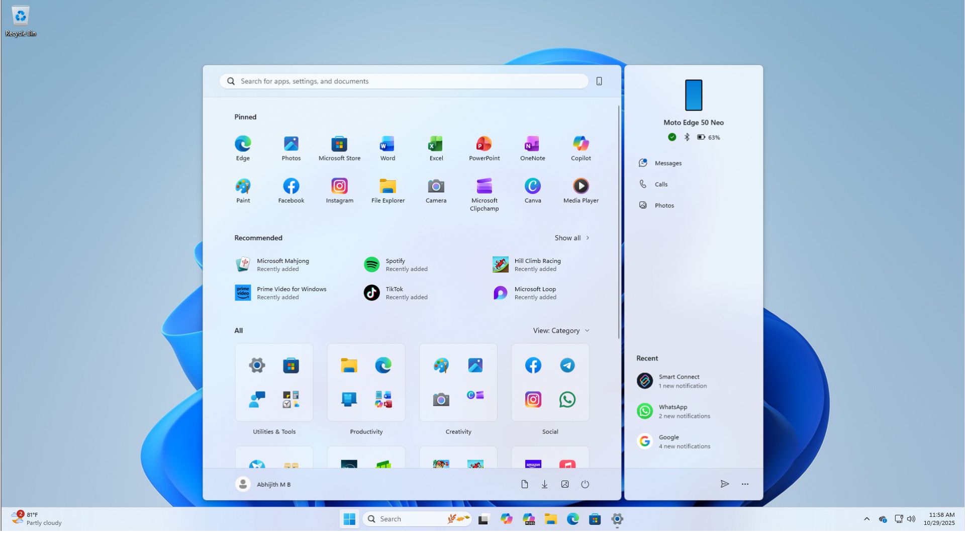
So, in a major upgrade to the Start menu in Windows 11 25H2 and 24H2, Microsoft is now adding everything the users wanted, from more customization to a single pane scrollable layout.
Windows Latest has tested all the new Start menu features in Windows 11, which Microsoft announced in early this year.
Scrollable All apps section in Start menu
As I said, one of the biggest criticisms Windows 11 Start menu faced was that people couldn’t stand clicking twice to see their all apps section.
In Windows 10, a single click on the Start button or on the Windows key showed a scrollable vertical list of all apps on the left side of the screen. Just beside that was the infamous Live Tiles, again as a scrollable list.
Because of Windows 10’s massive popularity over its 10-year life span, this single click became a muscle memory for most people, and it is understandable why they despised the idea of clicking the Start menu once and using the mouse pointer to click the All button to see their apps in one place.
Interestingly, Windows 7 also had a two-click setup to see all apps, but people still criticized Microsoft for changing the Start screen in Windows 10.
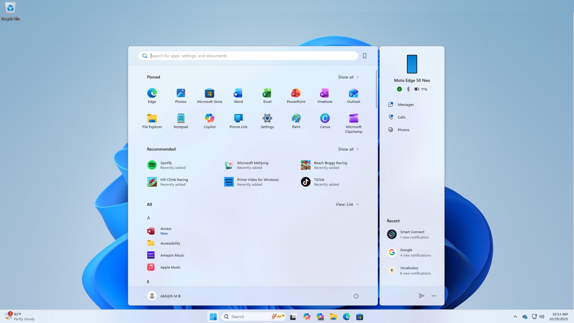
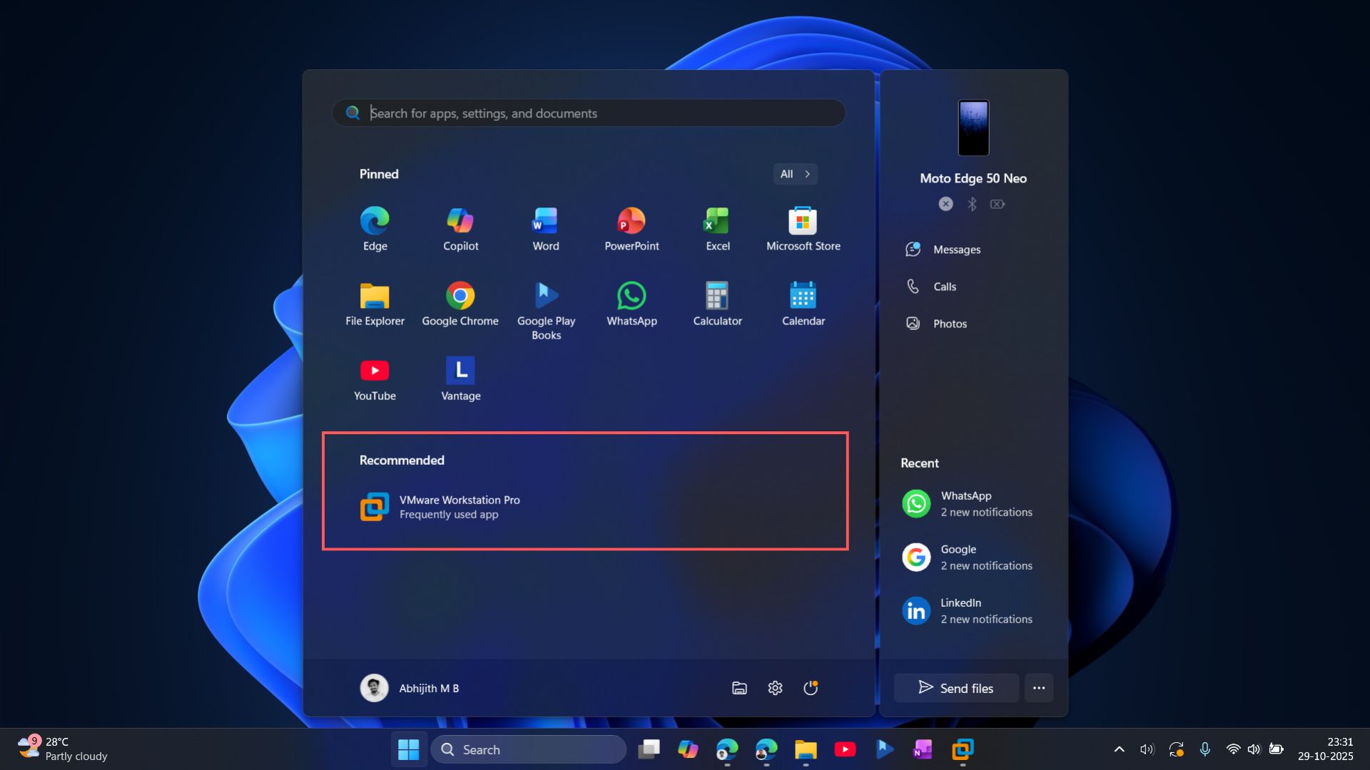
Till now, in Windows 11, clicking the Start button showed a grid of pinned apps on the top, with recommendations of apps, files, browsing history, and even tips and shortcuts.
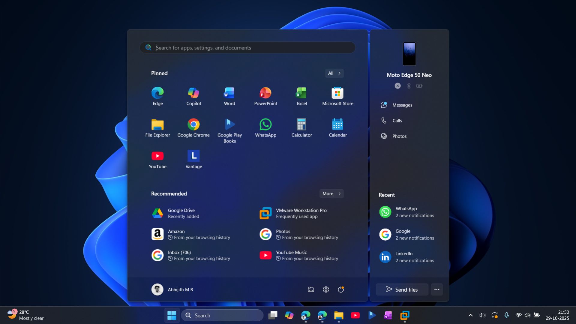
Of course, Microsoft gives you the option to customise this pane, and you can choose to turn on or off these recommendations.
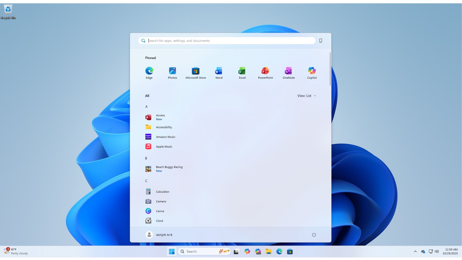
Then there was the All button on the top left of the Start screen, below the Search bar. This was used to see a vertical list of all apps.
I, for one, am now used to just using the Windows Search to open applications. But, I’m genuinely happy to see Microsoft bringing back single-click to see all apps in the Start screen.
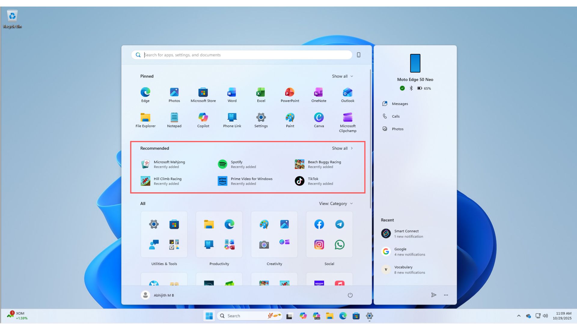
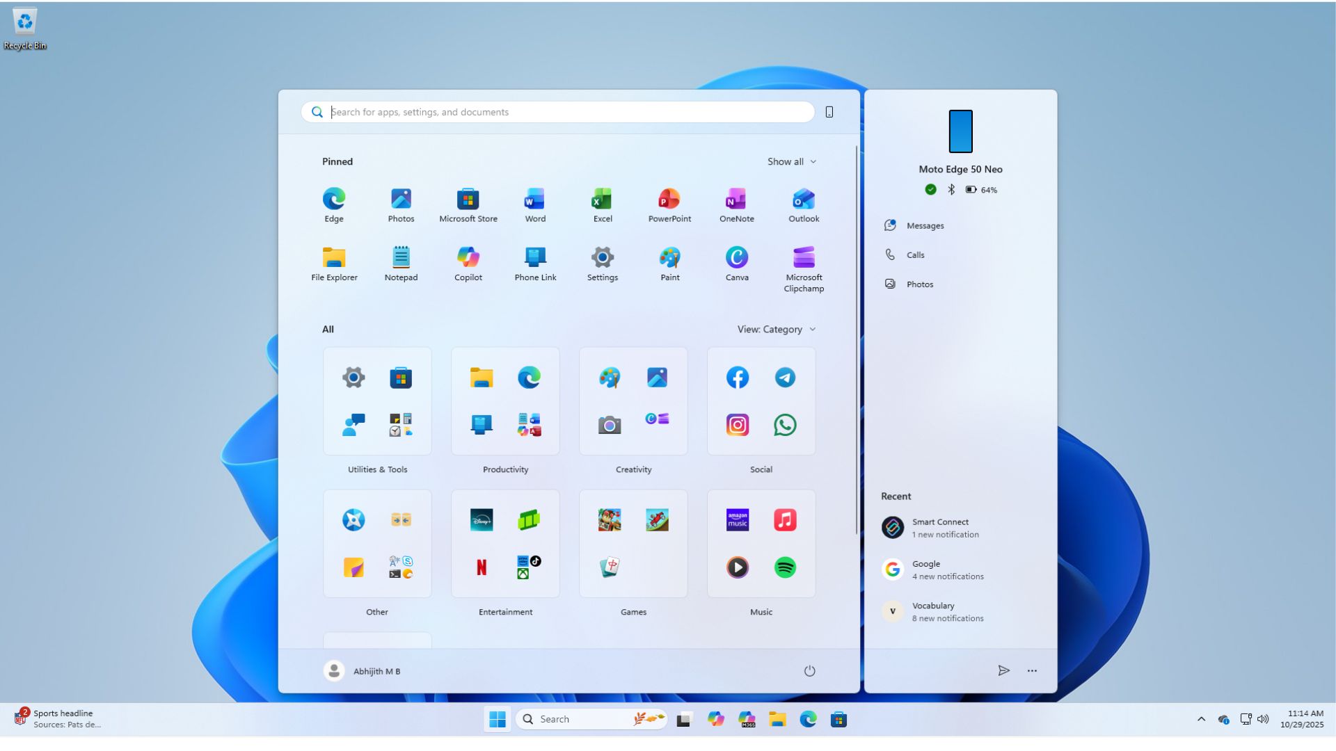
In 25H2, Windows 11 Start screen now has only one pane, instead of the previous two-pane setup.
There’s the pinned apps section on top, recommendations below, and followed by a scrollable All apps section, where, as you’d expect, you’ll see all your apps. But the best part is that you can customize how all apps are displayed.
Category view and Grid view of all apps in the Start menu
In February this year, Windows Latest tested and reported on the new Category and Grid view for All apps in the Windows 11 Start screen.
Back then, the All apps section was in a different pane, but now, since Microsoft has moved All apps to the single main page, grid view, category view, and the old list view of apps is now shown here. To be clear, there is no longer a separate page showing all apps. It’s only one page, in the main Start menu.
After you update to build Windows 11 Build 26200.7019 or Build 21200.7019, by default, you’ll see the Category view for All apps in the Start menu. Apps will be automatically grouped into different categories. In my PC, my apps are grouped into Utility & Tools, Productivity, Creativity, Social, Other, Entertainment, Games, Music, and Accessibility.
As of now, you cannot manually create any categories, which is fine if Microsoft is able to categorize apps properly. And from the likes of it, the categorization is spot on.
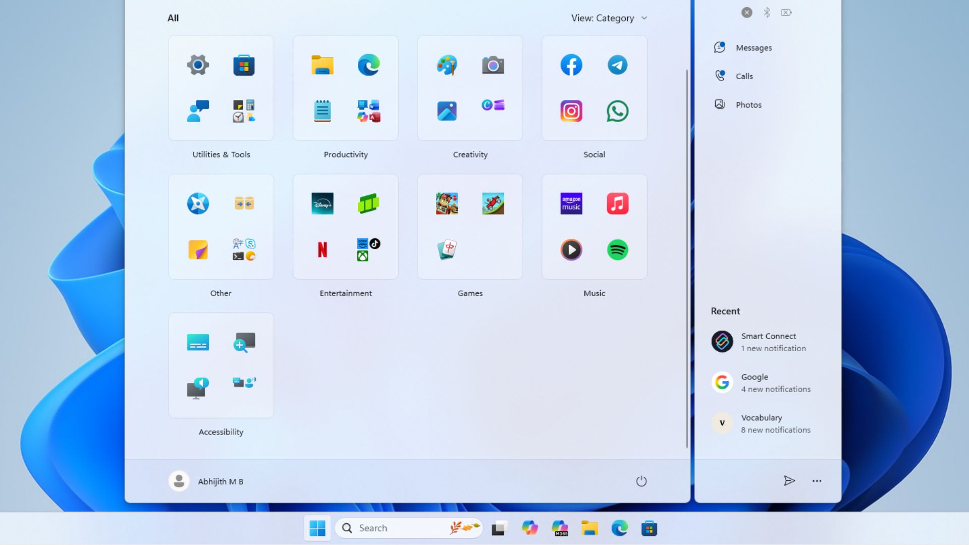
However, on my PC, Facebook and Instagram were first grouped under Other, then, when I installed WhatsApp, a new Social category was born, which means at least 3 apps of the same functionality are required to create a new category; otherwise, they’ll be grouped along with the closest match. As the categorization isn’t predetermined, it will be unique to each PC.
Apps in the categories are grouped into a 2×2 grid. If there are 3 apps in one category, there will be an extra space. If there are more than 4 apps, the additional apps will be shown as smaller icons, just like the app shelf in iOS.
Then there is the Grid view, which is more like a list of apps arranged horizontally, in vertical alphabetical order. It works as expected. The alphabet zoom-in animation when clicking on each alphabet is quite smooth and looks pleasing to the eye.
But I would actually prefer a grid style that looks like those on smartphones with apps in rows and columns, because there isn’t much difference functionally between the List view and the Grid view.
Customize or disable the Recommended section in the Start menu
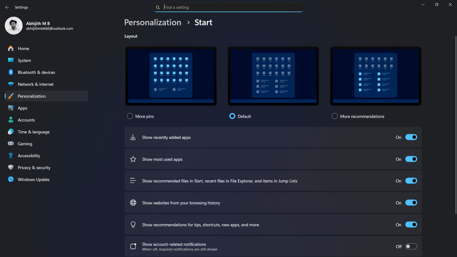
Previously, when you went to Settings > Personalization > Start, you would see three distinct options: More pins, Default, or More recommendations in the Start menu. Then, below that, you can customize it further by adding or removing recent apps, files, or other recommendations.
However, you couldn’t completely turn off Recommendations in the Start menu. For example, here I have disabled all recommendations, but still I can see at least one in my Start menu.
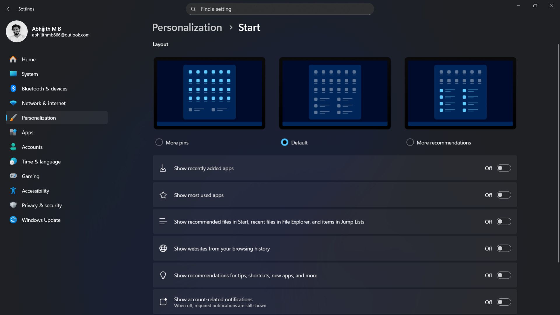
After installing the latest update for the Start menu, when you go to Personalization > Start, you can see a dedicated section for Recommended. Here, you can choose what to include in the Recommended section, and surely enough, if you turn off all the toggles for apps, files, and tips, the Recommended section completely disappears from Start.
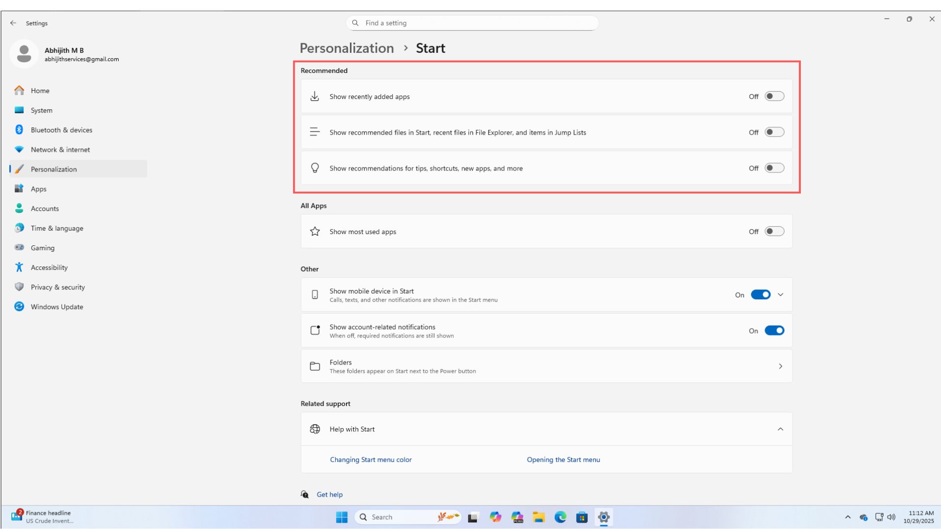
This gives more space for all apps and a cleaner look. From the Start settings, you can also choose to “Show most used apps” under the All Apps section. These settings were not categorized before the upgrade, making the Start screen settings page easier to comprehend.
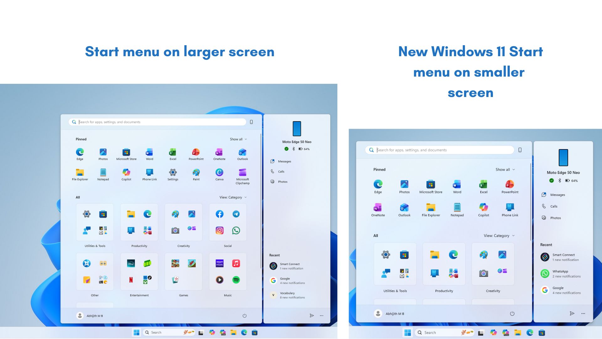
Start menu adapts based on screen size
In Windows 10, you could click and drag on the edge of the Start menu to adjust its size. Microsoft removed that functionality with Windows 11. However, with the latest update to the Start menu, we’re getting the next best thing.
Start menu now dynamically adjusts to the screen size and resolution. For larger screen sizes, the Start menu expands to show more pinned apps. We checked it with different monitors with different screen sizes, and noticed that the Start menu in the larger monitor looks cleaner with better use of space.
Better Phone Link integration in the Start menu
Phone Link panel on the Start menu gets even better with the ability to show missed calls, recent notifications, and text messages directly in Start.
Earlier, if you wanted to hide Phone Link, you could do that in Personalization > Start and turning off “Show mobile device in Start”. This option still exists in the Settings, but in the new update, the Start menu has a small icon that looks like a phone, beside the Search bar. Clicking this will hide the Phone Link panel in the Start menu. The animation is pretty smooth, and when clicked, it looks like the panel goes underneath the Start menu.
How to get the new Windows 11 Start menu?
Go to Settings > Windows Update > Check for updates. If available, you’ll see the prompt to download “Preview Update (KB5067036) (26200.7019)”. Windows 11 Start menu update for 24H2 and 25H2 builds is an optional preview update and is gradually rolling out.
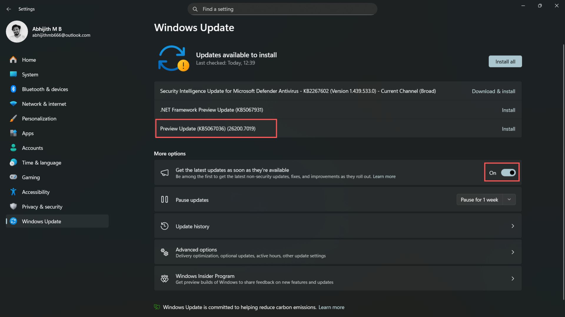
So, to increase your chances of getting it early, turn on “Get the latest updates as soon as they’re available” and then click the Check for updates button.
Remember that once you’ve applied the update, you will not be able to get back the old Start layout. Even as the update is optional for now, Microsoft will soon bundle it with a major update for the future.
Has the Start menu improved?
The primary function of the Start menu is to get you started with something, and ever since it came to Windows, the Start menu has revolutionized how we use the OS.
People’s opinions are quite subjective when it comes to Start menu design and functionality for various Windows versions. While some praise Windows 7’s Start menu for having everything they need, others still believe Windows XP has the best Start menu.
Windows 10 later got all the love for its quick access to the app list in the Start menu. There is no right answer here. Each Windows version had features that users raved about.
Unfortunately, when Microsoft launched Windows 11, it was touted to have the worst Start experience, just below Windows 8. However, the design wasn’t as bad as the functionality. Microsoft went with form over function, so much so that another company with that exact design principle also adopted it.
With the latest update for the Start menu, Microsoft has done something unprecedented that I never thought they would pull off.
The new Windows 11 Start menu is finally complete. It has everything you need, and you can customize it in any way you like.
What if you want the most minimal Start menu? Remove recommendations, add a single row of pinned apps, hide the Phone Link pane, and choose Category view or the plain list view.
What if you want to see everything in the Start menu? Add all kinds of recommendations, including files, apps, and web history. Add as many pinned apps as you want. Use the category layout. Enable Phone Link pane. Add Folders to the Start menu from the Settings. It gives you quick access to some important folders like Documents, Downloads, Pictures, etc.
The best part is that all of this makes the Start menu look good. Nothing looks out of place. And customization is at an all-time high. I’m sure that I will play with this more until I find the right setup, and then I might change again, simply because I care.
For the first time, I care how the Start menu looks, and that’s because I can customize it the way I like, while it looks aesthetic on my desktop. I like this new side of Microsoft that is paying more attention to how everything looks, and it is reminiscent of the recently updated Office apps’ logos.


")
")

 and it removes old modem drivers")
